
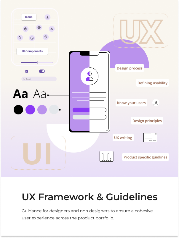
UX Framework
Establishment of a shared UX framework and guidelines.
ABB ROBOTICS
UX Strategy
DesignOps
Research
UX
UI
Goal:
Establish a shared UX framework to align designers, developers, and business stakeholders around a consistent approach to building user interfaces and interactive experiences across the organization’s robotics software products.
This initiative addresses fragmented design practices, inconsistent user experiences between applications, and limited UX involvement early in the product development process. The goal was to create a unified way of working that supports usability, consistency, and scalability, while positioning user experience as a core part of every project from the beginning.
Outcome:
A centralized UX design platform that defines principles, processes, and guidelines for creating usable, consistent, and brand aligned experiences across applications.
The platform enables teams to work more efficiently, reduces ambiguity in design decisions, and establishes a strong foundation for scaling both product development and overall design maturity across the organization.
My Role
Led the consolidation and structuring of existing UX guidelines, design conventions, and industry best practices into a unified framework.
Identified gaps in current ways of working and defined new principles and guidelines to establish a scalable foundation for user experience design across the organization. The work focused on improving consistency, efficiency, and overall quality in how UX is integrated into software development projects.
Tool & Process
- Figma Design: Used to gather and structure content, create visual models and illustrations, and design the layout and information architecture of the UX framework platform.
- Azure DevOps: Used as the hosting platform for the final framework, making it accessible to cross-functional teams and integrated into existing development workflows.
Overview
Project Aim
Define and establish a shared UX framework to guide how software development teams design and build user experiences across the organization’s product portfolio.
The aim was to reduce fragmentation between applications, create a more cohesive user experience, and introduce a consistent approach to UX within development workflows.
The framework was also designed to support teams without dedicated UX designers by providing foundational guidance on what user experience design is, why it matters, and how to apply it in practice within software development projects.
Key Challenges
- Designing a framework that is equally valuable to UX professionals, developers, and business stakeholders, each with different needs and levels of design maturity.
- Structuring content in a way that makes it easy to navigate and apply in real project contexts, rather than becoming static documentation.
- Identifying gaps and inconsistencies in existing guidelines, and defining missing principles to create a complete and reliable foundation.
- Ensuring the framework is accessible and integrated into existing tools and workflows so that it is actively used across the organization.
Process
Discovery and assessment
Starting the process with an assessment of the current situation revealed the need for two core sections within the UX framework.
The first focuses on the fundamentals of user experience, aimed at building a shared understanding of what UX design is, why it matters, and how it influences the product development process, particularly for non design professionals.
The second focuses on practical guidance for applying UX and UI principles in day to day work. This includes the use of the design system, UI components, iconography, aspect ratio and spacing scales, UX writing, typography, and designing for different platforms, including responsive design.
Together, these sections create a balance between foundational understanding and hands on guidance, ensuring the framework is both educational and actionable.
Following this, the content of the framework was defined through consolidation, validation, and gap analysis. Existing guidelines, documentation, and informal conventions within the design team were gathered and structured into a single source. This included practices related to content design, UI construction, and interaction patterns that had previously been applied inconsistently or were not formally documented.
To ensure alignment beyond the design team, workshops were conducted with business and project stakeholders to define a shared UX direction and establish a broader strategic foundation.
In parallel, industry best practices were reviewed to validate and strengthen the rationale behind existing guidelines. This process also helped identify gaps in the current material, leading to the definition of new guidelines where coverage was missing. References to external resources were included to support continued learning and enable teams to deepen their understanding of UX design when needed.
Defining principles and structure
To define a scalable and consistent approach to UX across the organization, I developed a two-layer framework that connects decision-making principles with practical design guidance.
The structure is intentionally divided into two core sections: Fundamentals of User Experience and Practical Guidance for Applying UX and UI Principles.
The Fundamentals layer establishes a shared perspective on how we approach user experience design. It defines core principles and aligns teams around what “usable” means in our context, creating a foundation for consistent decision-making.
The Practical Guidance layer translates these principles into actionable design practices. It provides common building blocks, interaction patterns, and UI conventions that teams can apply in their daily work, ensuring consistency and scalability across products.
This structure was designed to bridge the gap between abstract principles and day-to-day execution.
Fundamentals of User Experience
More then what meets the eye




A widespread misconception is that design is primarily concerned with aesthetics, often reduced to “making things look pretty.” This overlooks the fact that design is fundamentally about solving problems, communicating information, and making informed decisions based on user needs, context, and constraints.
In practice, every design outcome is the result of a structured process involving research, evaluation, and iteration, where multiple factors are considered to achieve a specific purpose.
To make this more tangible, the framework introduces two key metaphors. The iceberg model illustrates that visual design represents only a small, visible part of the overall experience. Beneath the surface lies research, interaction design, information architecture, and continuous validation.
The house metaphor reinforces this by showing that user experience must be built from a strong foundation. A polished interface cannot compensate for weak underlying structure, and UX cannot be treated as an afterthought applied at the end of a project.
Together, these concepts establish a shared understanding that user experience should guide product development from the very beginning. At each stage, decisions should be informed by user needs, industry best practices, and an understanding of the broader business and competitive context.

There is so much more to user experience design than what first meets the eye. Designing products with the user experience as an explicit outcome means looking beyond the functional or aesthetics. UX design is a process starting with a defined strategy.

Great user experiences are built from the ground up.
Defining Usability:
To fully understand the fundamentals of user experience, the framework clarifies the relationship between usability and utility. Usability refers to how easy and efficient something is to use, while utility refers to whether it provides the functionality that users actually need.
This distinction is important because a product can be highly usable yet still fail if it does not solve the right problem. If the underlying utility is missing, ease of use alone has limited value.
Including this perspective in the framework helps shift the focus from interface quality alone to overall product value. It reinforces that UX decisions should not only aim to improve usability, but also ensure that what is being built is relevant and meaningful to users from the outset.
Usability

Efficient

Intuitive

Satisfying
“The extent to which a product can be used by specified users to achieve specified goals with effectiveness, efficiency and satisfaction in a specific context of use”
- ISO 9241-11
Design process
The next subsection of the framework outlines an ideal design process, describing each stage and its role in creating effective user experiences. The purpose was to provide teams with a clear structure for how UX work should be approached throughout a project, from early discovery to final validation.
In addition to defining each step, commonly used methods are introduced and explained to support teams in applying the process in practice. This was particularly important to ensure that both designers and non design professionals understand not only what to do, but why each activity contributes to a better end result.
The process is also closely connected to the iceberg metaphor, where each stage corresponds to different layers beneath the surface. Early phases such as research and problem definition form the foundation, while interaction design, structure, and validation build upward toward the final interface. This connection reinforces the idea that strong outcomes depend on the work done beneath the surface, not just the visible result.
By making the process explicit and actionable, the framework supports more informed decision making and leads to more effective and user centered solutions.

Test

Empathize
Define
Ideate
Prototype
Implement


Artefact


Need

Fulfilment
Behind great design lays a whole process of thoughts and decision making where the designer considers a range of factors in order to achieve a specific purpose.
Know your users
The final subsection within the fundamentals of user experience focuses on understanding users and their role in the design process. It introduces who the users are, why they matter, and how their goals and needs shape the direction of the product.
To strengthen this understanding, all user personas were consolidated in one place to provide a clear overview of the different user types across the product portfolio. In addition, a schematic was created to map the various applications within the robotics simulation workflow, showing how they relate to different stages of the process.
This visualization also highlights where each persona interacts with the system and what their goals are at different points in their workflow. By connecting personas, applications, and process stages, the framework helps create a clearer understanding of how different user needs emerge and evolve throughout the product ecosystem.
You
=
User

It is important to get to know the user from the target audience and make informed decisions based on their needs.
Practical guidance for applying UX and UI principles
The 10 Usability Heuristics
The first component of the Practical Guidance layer is a set of 10 usability heuristics, which serve as a foundation for evaluating and guiding design decisions.
For designers, these heuristics act as a structured checklist to assess whether their solutions align with established usability principles and industry best practices. They support more consistent and objective design reviews, reducing reliance on subjective opinions.
For non-designers, the heuristics provide an accessible introduction to what defines a good user experience. They help cross-functional teams understand the rationale behind design decisions and create a shared language for discussing usability and quality.
By embedding these heuristics into the framework, teams are better equipped to design, review, and iterate on experiences in a consistent and informed way.
Design System Components
There was a clear need for more structured guidance on when to use specific design system components. While the components themselves were available, their application varied across products, leading to inconsistencies in interaction patterns and user experience.
To address this, structured guidance was introduced for all design system components such as buttons, checkboxes, and input fields. Each component is documented with clear definitions, usage guidelines, and interaction rules to support consistent application.
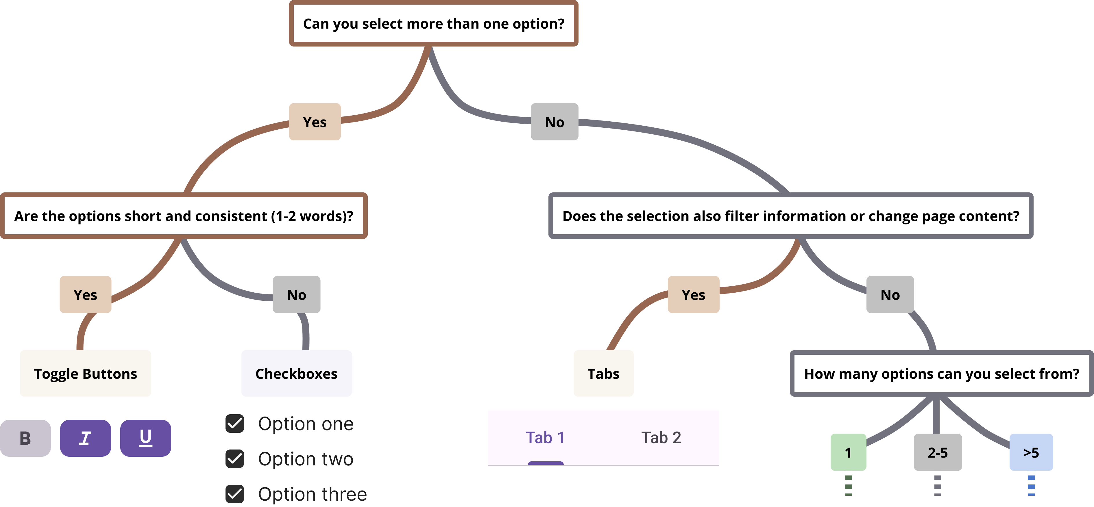
To further support decision-making, components are accompanied by decision models that guide users through a set of structured questions. For example, whether multiple selections are possible, or whether an action is applied immediately. Based on these responses, teams are directed toward the most appropriate component, reducing ambiguity in selection.
A recurring example identified during this work was the misuse of checkboxes in scenarios where toggle switches would have been more appropriate. Checkboxes were often used for binary settings that triggered immediate changes, despite being conventionally associated with multi-selection or form-based input.
By introducing structured decision models, the framework supports more informed and consistent component selection across teams.
This also makes it easier for designers to justify their choice of UI components through clear rationale, while improving cross-functional understanding for developers and other non-design stakeholders. As a result, ambiguity is reduced and implementation becomes more consistent across products.
Icon Guidelines
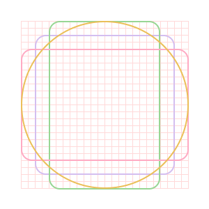
To further support consistency across the design system, icon guidelines were defined and documented to provide a shared framework for creating and using icons whenever new icons are required.
The guidelines specify key parameters such as grid size, keylines, stroke width, and visual language. These technical rules ensure that all icons are built on the same underlying structure and maintain visual consistency across the system.
In addition to these technical specifications, the guidelines also define design principles for icons. These include clarity, simplicity, and recognisability at small sizes. In practice, this means that icons should be easy to understand at a glance, avoid unnecessary detail, and remain readable even when scaled down for use in compact interface elements such as toolbars or mobile screens.
Together, these principles ensure that icons are not only visually consistent, but also functional and effective across different contexts and screen resolutions.
By providing a structured reference for icon creation, the guidelines reduce variation between contributors and ensure that newly created icons integrate seamlessly into the existing system.


Responsive Design
Guidelines for responsive design were defined to support consistent behavior across different screen sizes, with a particular focus on mobile-first interfaces.
The section outlined key principles for how layouts should adapt across breakpoints, including grid structure and grid behavior. It also defined how components and layouts should respond to changes in screen size, ensuring predictable and consistent transitions between different viewports.
In addition, the guidelines covered aspects such as layout autonomy, aspect ratios, fixed base units, and panel behavior. These rules helped ensure that interface elements scaled and reflowed in a controlled and intentional way, rather than adapting inconsistently across products.
By establishing these principles, the framework supported more consistent responsive behavior and improved the overall usability of interfaces across devices and screen sizes.
UX Writing Guidelines
UX writing guidelines were defined to establish a shared foundation for how content and interface text should be written across products.
The guidelines cover core principles of UX writing, including the use of plain language, tone of voice, and avoiding unnecessary jargon. The tone of voice section defines what our tone should be, as well as what it is not, helping to create a clear and consistent writing style across all product touchpoints.
They also address how to write for different audiences, including both general users and domain experts, ensuring that content remains clear, appropriate, and accessible in context.
In addition, the guidelines include principles for formatting and structuring content, supporting readability and consistency across interfaces. This includes considerations such as hierarchy, scannability, and how information is grouped and presented within screens.
To support practical understanding, the guidelines are accompanied by examples demonstrating how they should be applied in real interface contexts. These examples show how the principles translate into actual UX writing decisions, helping teams understand how to use the guidelines in practice.

Our tone of voice is...


Our tone of voice is not...

User Research
To support more consistent use of user research across teams, a basic structure was defined for how research should be documented and where it should be stored, including a shared understanding of methodology.
Previously, research was often difficult to locate or scattered across different locations, which made it harder for teams to reuse existing insights and sometimes led to duplicated efforts.
To address this, efforts were made to consolidate user research into a single shared location, making it easier for teams to access and reuse findings. Guidance was also introduced to support more consistent documentation of new research.
Having a single shared location is a better approach as it minimizes duplication and improves access to existing insights across teams.
This helps teams build on existing knowledge rather than repeating previous work, improving alignment and making user insights more accessible across product development.
Product Specific Guidelines
Product-specific guidelines were defined to account for differences across the product suite, which includes a legacy desktop application, a newer web application, and a mobile application.
Designing across these platforms requires different considerations, as the conditions, constraints, and interaction patterns vary significantly between them. A single, uniform approach is not always appropriate, particularly given the differences in technical constraints and user context.
These guidelines document key product-specific factors to consider when designing for each platform, helping teams make more informed decisions and ensuring that solutions are appropriate for the context in which they are used.
Outcome
The outcome of the project was a UX framework approved by both stakeholders and team members, establishing a shared foundation for how user experience is approached across the department.
To support adoption and increase awareness, a digital seminar was conducted. The session focused on the role of user experience in software development and aimed to strengthen understanding of how UX contributes to building better products. It highlighted how UX influences product quality and decision-making, and why it should be considered throughout the entire development process rather than only at the end. This initiative helped extend UX awareness beyond the design team and encouraged a more user-centered mindset across disciplines.

Today, the framework is used as a shared reference point for development teams without dedicated UX support when seeking guidance on design decisions. It also serves as an onboarding resource for both new UX designers and developers, helping them understand how UX is integrated into the product development process.
In addition, it provides day-to-day support for the design team by offering clear principles and structured guidance for making consistent design decisions.

Technology
Design
Business
UX
Main Takeaways
- A UX framework is not a one-time deliverable. It requires ongoing maintenance, iteration, and refinement to remain relevant as products, teams, and needs evolve.
- Balancing depth and usability is a key challenge. A framework needs to provide enough detail to be useful while remaining structured and easy to navigate to avoid becoming overwhelming or fragmented.
- Achieving consistency across a product organization requires shared principles and tools. A common UX framework helps align teams over time by establishing a shared vocabulary for design decisions.
- A well-defined framework provides valuable support for design professionals by offering clear principles and guidance for making and communicating design decisions, leading to more consistent and confident outcomes.
- Design is increasingly moving beyond interface delivery and becoming a strategic driver of product adoption and experience quality, which highlights the need for shared frameworks that enable consistent UX decision-making across teams.

UX Framework
Establishment of a shared UX framework and guidelines.
ABB ROBOTICS
UX Strategy
DesignOps
Research
UX
UI
Goal:
Establish a shared UX framework to align designers, developers, and business stakeholders around a consistent approach to building user interfaces and interactive experiences across the organization’s robotics software products.
This initiative addresses fragmented design practices, inconsistent user experiences between applications, and limited UX involvement early in the product development process. The goal was to create a unified way of working that supports usability, consistency, and scalability, while positioning user experience as a core part of every project from the beginning.
Outcome:
A centralized UX design platform that defines principles, processes, and guidelines for creating usable, consistent, and brand aligned experiences across applications.
The platform enables teams to work more efficiently, reduces ambiguity in design decisions, and establishes a strong foundation for scaling both product development and overall design maturity across the organization.
My Role
Led the consolidation and structuring of existing UX guidelines, design conventions, and industry best practices into a unified framework.
Identified gaps in current ways of working and defined new principles and guidelines to establish a scalable foundation for user experience design across the organization. The work focused on improving consistency, efficiency, and overall quality in how UX is integrated into software development projects.
Tool & Process
- Figma Design: Used to gather and structure content, create visual models and illustrations, and design the layout and information architecture of the UX framework platform.
- Azure DevOps: Used as the hosting platform for the final framework, making it accessible to cross-functional teams and integrated into existing development workflows.
Overview
Project Aim
Define and establish a shared UX framework to guide how software development teams design and build user experiences across the organization’s product portfolio.
The aim was to reduce fragmentation between applications, create a more cohesive user experience, and introduce a consistent approach to UX within development workflows.
The framework was also designed to support teams without dedicated UX designers by providing foundational guidance on what user experience design is, why it matters, and how to apply it in practice within software development projects.
Key Challenges
- Designing a framework that is equally valuable to UX professionals, developers, and business stakeholders, each with different needs and levels of design maturity.
- Structuring content in a way that makes it easy to navigate and apply in real project contexts, rather than becoming static documentation.
- Identifying gaps and inconsistencies in existing guidelines, and defining missing principles to create a complete and reliable foundation.
- Ensuring the framework is accessible and integrated into existing tools and workflows so that it is actively used across the organization.
Process
Discovery and assessment
Starting the process with an assessment of the current situation revealed the need for two core sections within the UX framework.
The first focuses on the fundamentals of user experience, aimed at building a shared understanding of what UX design is, why it matters, and how it influences the product development process, particularly for non design professionals.
The second focuses on practical guidance for applying UX and UI principles in day to day work. This includes the use of the design system, UI components, iconography, aspect ratio and spacing scales, UX writing, typography, and designing for different platforms, including responsive design.
Together, these sections create a balance between foundational understanding and hands on guidance, ensuring the framework is both educational and actionable.
Following this, the content of the framework was defined through consolidation, validation, and gap analysis. Existing guidelines, documentation, and informal conventions within the design team were gathered and structured into a single source. This included practices related to content design, UI construction, and interaction patterns that had previously been applied inconsistently or were not formally documented.
To ensure alignment beyond the design team, workshops were conducted with business and project stakeholders to define a shared UX direction and establish a broader strategic foundation.
In parallel, industry best practices were reviewed to validate and strengthen the rationale behind existing guidelines. This process also helped identify gaps in the current material, leading to the definition of new guidelines where coverage was missing. References to external resources were included to support continued learning and enable teams to deepen their understanding of UX design when needed.
Defining principles and structure
To define a scalable and consistent approach to UX across the organization, I developed a two-layer framework that connects decision-making principles with practical design guidance.
The structure is intentionally divided into two core sections: Fundamentals of User Experience and Practical Guidance for Applying UX and UI Principles.
The Fundamentals layer establishes a shared perspective on how we approach user experience design. It defines core principles and aligns teams around what “usable” means in our context, creating a foundation for consistent decision-making.
The Practical Guidance layer translates these principles into actionable design practices. It provides common building blocks, interaction patterns, and UI conventions that teams can apply in their daily work, ensuring consistency and scalability across products.
This structure was designed to bridge the gap between abstract principles and day-to-day execution.
Fundamentals of User Experience
More then what meets the eye




A widespread misconception is that design is primarily concerned with aesthetics, often reduced to “making things look pretty.” This overlooks the fact that design is fundamentally about solving problems, communicating information, and making informed decisions based on user needs, context, and constraints.
In practice, every design outcome is the result of a structured process involving research, evaluation, and iteration, where multiple factors are considered to achieve a specific purpose.
To make this more tangible, the framework introduces two key metaphors. The iceberg model illustrates that visual design represents only a small, visible part of the overall experience. Beneath the surface lies research, interaction design, information architecture, and continuous validation.
The house metaphor reinforces this by showing that user experience must be built from a strong foundation. A polished interface cannot compensate for weak underlying structure, and UX cannot be treated as an afterthought applied at the end of a project.
Together, these concepts establish a shared understanding that user experience should guide product development from the very beginning. At each stage, decisions should be informed by user needs, industry best practices, and an understanding of the broader business and competitive context.

There is so much more to user experience design than what first meets the eye. Designing products with the user experience as an explicit outcome means looking beyond the functional or aesthetics. UX design is a process starting with a defined strategy.
Great user experiences are built from the ground up.

Defining Usability:
To fully understand the fundamentals of user experience, the framework clarifies the relationship between usability and utility. Usability refers to how easy and efficient something is to use, while utility refers to whether it provides the functionality that users actually need.
This distinction is important because a product can be highly usable yet still fail if it does not solve the right problem. If the underlying utility is missing, ease of use alone has limited value.
Including this perspective in the framework helps shift the focus from interface quality alone to overall product value. It reinforces that UX decisions should not only aim to improve usability, but also ensure that what is being built is relevant and meaningful to users from the outset.
Usability
“The extent to which a product can be used by specified users to achieve specified goals with effectiveness, efficiency and satisfaction in a specific context of use”
- ISO 9241-11
Efficient
Intuitive
Satisfying
Design process
The next subsection of the framework outlines an ideal design process, describing each stage and its role in creating effective user experiences. The purpose was to provide teams with a clear structure for how UX work should be approached throughout a project, from early discovery to final validation.
In addition to defining each step, commonly used methods are introduced and explained to support teams in applying the process in practice. This was particularly important to ensure that both designers and non design professionals understand not only what to do, but why each activity contributes to a better end result.
The process is also closely connected to the iceberg metaphor, where each stage corresponds to different layers beneath the surface. Early phases such as research and problem definition form the foundation, while interaction design, structure, and validation build upward toward the final interface. This connection reinforces the idea that strong outcomes depend on the work done beneath the surface, not just the visible result.
By making the process explicit and actionable, the framework supports more informed decision making and leads to more effective and user centered solutions.

Test

Empathize
Define
Ideate
Prototype
Implement


Artefact


Need

Fulfilment
Behind great design lays a whole process of thoughts and decision making where the designer considers a range of factors in order to achieve a specific purpose.
Know your users
The final subsection within the fundamentals of user experience focuses on understanding users and their role in the design process. It introduces who the users are, why they matter, and how their goals and needs shape the direction of the product.
To strengthen this understanding, all user personas were consolidated in one place to provide a clear overview of the different user types across the product portfolio. In addition, a schematic was created to map the various applications within the robotics simulation workflow, showing how they relate to different stages of the process.
This visualization also highlights where each persona interacts with the system and what their goals are at different points in their workflow. By connecting personas, applications, and process stages, the framework helps create a clearer understanding of how different user needs emerge and evolve throughout the product ecosystem.
You
=
User

It is important to get to know the user from the target audience and make informed decisions based on their needs.
Practical guidance for applying UX and UI principles
The 10 Usability Heuristics
The first component of the Practical Guidance layer is a set of 10 usability heuristics, which serve as a foundation for evaluating and guiding design decisions.
For designers, these heuristics act as a structured checklist to assess whether their solutions align with established usability principles and industry best practices. They support more consistent and objective design reviews, reducing reliance on subjective opinions.
For non-designers, the heuristics provide an accessible introduction to what defines a good user experience. They help cross-functional teams understand the rationale behind design decisions and create a shared language for discussing usability and quality.
By embedding these heuristics into the framework, teams are better equipped to design, review, and iterate on experiences in a consistent and informed way.
Design System Components
There was a clear need for more structured guidance on when to use specific design system components. While the components themselves were available, their application varied across products, leading to inconsistencies in interaction patterns and user experience.
To address this, structured guidance was introduced for all design system components such as buttons, checkboxes, and input fields. Each component is documented with clear definitions, usage guidelines, and interaction rules to support consistent application.
To further support decision-making, components are accompanied by decision models that guide users through a set of structured questions. For example, whether multiple selections are possible, or whether an action is applied immediately. Based on these responses, teams are directed toward the most appropriate component, reducing ambiguity in selection.
A recurring example identified during this work was the misuse of checkboxes in scenarios where toggle switches would have been more appropriate. Checkboxes were often used for binary settings that triggered immediate changes, despite being conventionally associated with multi-selection or form-based input.
By introducing structured decision models, the framework supports more informed and consistent component selection across teams.
This also makes it easier for designers to justify their choice of UI components through clear rationale, while improving cross-functional understanding for developers and other non-design stakeholders. As a result, ambiguity is reduced and implementation becomes more consistent across products.
Icon Guidelines
To further support consistency across the design system, icon guidelines were defined and documented to provide a shared framework for creating and using icons whenever new icons are required.
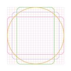
The guidelines specify key parameters such as grid size, keylines, stroke width, and visual language. These technical rules ensure that all icons are built on the same underlying structure and maintain visual consistency across the system.
In addition to these technical specifications, the guidelines also define design principles for icons. These include clarity, simplicity, and recognisability at small sizes. In practice, this means that icons should be easy to understand at a glance, avoid unnecessary detail, and remain readable even when scaled down for use in compact interface elements such as toolbars or mobile screens.
Together, these principles ensure that icons are not only visually consistent, but also functional and effective across different contexts and screen resolutions.
By providing a structured reference for icon creation, the guidelines reduce variation between contributors and ensure that newly created icons integrate seamlessly into the existing system.


Responsive Design
Guidelines for responsive design were defined to support consistent behavior across different screen sizes, with a particular focus on mobile-first interfaces.
The section outlined key principles for how layouts should adapt across breakpoints, including grid structure and grid behavior. It also defined how components and layouts should respond to changes in screen size, ensuring predictable and consistent transitions between different viewports.
In addition, the guidelines covered aspects such as layout autonomy, aspect ratios, fixed base units, and panel behavior. These rules helped ensure that interface elements scaled and reflowed in a controlled and intentional way, rather than adapting inconsistently across products.
By establishing these principles, the framework supported more consistent responsive behavior and improved the overall usability of interfaces across devices and screen sizes.
UX Writing Guidelines
UX writing guidelines were defined to establish a shared foundation for how content and interface text should be written across products.
The guidelines cover core principles of UX writing, including the use of plain language, tone of voice, and avoiding unnecessary jargon. The tone of voice section defines what our tone should be, as well as what it is not, helping to create a clear and consistent writing style across all product touchpoints.
They also address how to write for different audiences, including both general users and domain experts, ensuring that content remains clear, appropriate, and accessible in context.
In addition, the guidelines include principles for formatting and structuring content, supporting readability and consistency across interfaces. This includes considerations such as hierarchy, scannability, and how information is grouped and presented within screens.
To support practical understanding, the guidelines are accompanied by examples demonstrating how they should be applied in real interface contexts. These examples show how the principles translate into actual UX writing decisions, helping teams understand how to use the guidelines in practice.

Our tone of voice is...


Our tone of voice is not...

User Research
To support more consistent use of user research across teams, a basic structure was defined for how research should be documented and where it should be stored, including a shared understanding of methodology.
Previously, research was often difficult to locate or scattered across different locations, which made it harder for teams to reuse existing insights and sometimes led to duplicated efforts.
To address this, efforts were made to consolidate user research into a single shared location, making it easier for teams to access and reuse findings. Guidance was also introduced to support more consistent documentation of new research.
Having a single shared location is a better approach as it minimizes duplication and improves access to existing insights across teams.
This helps teams build on existing knowledge rather than repeating previous work, improving alignment and making user insights more accessible across product development.
Product Specific Guidelines
Product-specific guidelines were defined to account for differences across the product suite, which includes a legacy desktop application, a newer web application, and a mobile application.
Designing across these platforms requires different considerations, as the conditions, constraints, and interaction patterns vary significantly between them. A single, uniform approach is not always appropriate, particularly given the differences in technical constraints and user context.
These guidelines document key product-specific factors to consider when designing for each platform, helping teams make more informed decisions and ensuring that solutions are appropriate for the context in which they are used.
Outcome
The outcome of the project was a UX framework approved by both stakeholders and team members, establishing a shared foundation for how user experience is approached across the department.
To support adoption and increase awareness, a digital seminar was conducted. The session focused on the role of user experience in software development and aimed to strengthen understanding of how UX contributes to building better products. It highlighted how UX influences product quality and decision-making, and why it should be considered throughout the entire development process rather than only at the end. This initiative helped extend UX awareness beyond the design team and encouraged a more user-centered mindset across disciplines.
Today, the framework is used as a shared reference point for development teams without dedicated UX support when seeking guidance on design decisions. It also serves as an onboarding resource for both new UX designers and developers, helping them understand how UX is integrated into the product development process.
In addition, it provides day-to-day support for the design team by offering clear principles and structured guidance for making consistent design decisions.

Technology
Design
Business
UX
Main Takeaways
- A UX framework is not a one-time deliverable. It requires ongoing maintenance, iteration, and refinement to remain relevant as products, teams, and needs evolve.
- Balancing depth and usability is a key challenge. A framework needs to provide enough detail to be useful while remaining structured and easy to navigate to avoid becoming overwhelming or fragmented.
- Achieving consistency across a product organization requires shared principles and tools. A common UX framework helps align teams over time by establishing a shared vocabulary for design decisions.
- A well-defined framework provides valuable support for design professionals by offering clear principles and guidance for making and communicating design decisions, leading to more consistent and confident outcomes.
- Design is increasingly moving beyond interface delivery and becoming a strategic driver of product adoption and experience quality, which highlights the need for shared frameworks that enable consistent UX decision-making across teams.
UX Framework
Establishment of a shared UX framework and guidelines.
ABB ROBOTICS
UX Strategy
DesignOps
Research
UX
UI
Goal:
Establish a shared UX framework to align designers, developers, and business stakeholders around a consistent approach to building user interfaces and interactive experiences across the organization’s robotics software products.
This initiative addresses fragmented design practices, inconsistent user experiences between applications, and limited UX involvement early in the product development process. The goal was to create a unified way of working that supports usability, consistency, and scalability, while positioning user experience as a core part of every project from the beginning.
Outcome:
A centralized UX design platform that defines principles, processes, and guidelines for creating usable, consistent, and brand aligned experiences across applications.
The platform enables teams to work more efficiently, reduces ambiguity in design decisions, and establishes a strong foundation for scaling both product development and overall design maturity across the organization.
My Role
Led the consolidation and structuring of existing UX guidelines, design conventions, and industry best practices into a unified framework.
Identified gaps in current ways of working and defined new principles and guidelines to establish a scalable foundation for user experience design across the organization. The work focused on improving consistency, efficiency, and overall quality in how UX is integrated into software development projects.
Tool & Process
- Figma Design: Used to gather and structure content, create visual models and illustrations, and design the layout and information architecture of the UX framework platform.
- Azure DevOps: Used as the hosting platform for the final framework, making it accessible to cross-functional teams and integrated into existing development workflows.
Overview
Project Aim
Define and establish a shared UX framework to guide how software development teams design and build user experiences across the organization’s product portfolio.
The aim was to reduce fragmentation between applications, create a more cohesive user experience, and introduce a consistent approach to UX within development workflows.
The framework was also designed to support teams without dedicated UX designers by providing foundational guidance on what user experience design is, why it matters, and how to apply it in practice within software development projects.
Key Challenges
- Designing a framework that is equally valuable to UX professionals, developers, and business stakeholders, each with different needs and levels of design maturity.
- Structuring content in a way that makes it easy to navigate and apply in real project contexts, rather than becoming static documentation.
- Identifying gaps and inconsistencies in existing guidelines, and defining missing principles to create a complete and reliable foundation.
- Ensuring the framework is accessible and integrated into existing tools and workflows so that it is actively used across the organization.
Process
Discovery and assessment
Starting the process with an assessment of the current situation revealed the need for two core sections within the UX framework.
The first focuses on the fundamentals of user experience, aimed at building a shared understanding of what UX design is, why it matters, and how it influences the product development process, particularly for non design professionals.
The second focuses on practical guidance for applying UX and UI principles in day to day work. This includes the use of the design system, UI components, iconography, aspect ratio and spacing scales, UX writing, typography, and designing for different platforms, including responsive design.
Together, these sections create a balance between foundational understanding and hands on guidance, ensuring the framework is both educational and actionable.
Following this, the content of the framework was defined through consolidation, validation, and gap analysis. Existing guidelines, documentation, and informal conventions within the design team were gathered and structured into a single source. This included practices related to content design, UI construction, and interaction patterns that had previously been applied inconsistently or were not formally documented.
To ensure alignment beyond the design team, workshops were conducted with business and project stakeholders to define a shared UX direction and establish a broader strategic foundation.
In parallel, industry best practices were reviewed to validate and strengthen the rationale behind existing guidelines. This process also helped identify gaps in the current material, leading to the definition of new guidelines where coverage was missing. References to external resources were included to support continued learning and enable teams to deepen their understanding of UX design when needed.
Defining principles and structure
To define a scalable and consistent approach to UX across the organization, I developed a two-layer framework that connects decision-making principles with practical design guidance.
The structure is intentionally divided into two core sections: Fundamentals of User Experience and Practical Guidance for Applying UX and UI Principles.
The Fundamentals layer establishes a shared perspective on how we approach user experience design. It defines core principles and aligns teams around what “usable” means in our context, creating a foundation for consistent decision-making.
The Practical Guidance layer translates these principles into actionable design practices. It provides common building blocks, interaction patterns, and UI conventions that teams can apply in their daily work, ensuring consistency and scalability across products.
This structure was designed to bridge the gap between abstract principles and day-to-day execution.
Fundamentals of User Experience
More then what meets the eye




A widespread misconception is that design is primarily concerned with aesthetics, often reduced to “making things look pretty.” This overlooks the fact that design is fundamentally about solving problems, communicating information, and making informed decisions based on user needs, context, and constraints.
In practice, every design outcome is the result of a structured process involving research, evaluation, and iteration, where multiple factors are considered to achieve a specific purpose.
To make this more tangible, the framework introduces two key metaphors. The iceberg model illustrates that visual design represents only a small, visible part of the overall experience. Beneath the surface lies research, interaction design, information architecture, and continuous validation.
The house metaphor reinforces this by showing that user experience must be built from a strong foundation. A polished interface cannot compensate for weak underlying structure, and UX cannot be treated as an afterthought applied at the end of a project.
Together, these concepts establish a shared understanding that user experience should guide product development from the very beginning. At each stage, decisions should be informed by user needs, industry best practices, and an understanding of the broader business and competitive context.

There is so much more to user experience design than what first meets the eye. Designing products with the user experience as an explicit outcome means looking beyond the functional or aesthetics. UX design is a process starting with a defined strategy.
Great user experiences are built from the ground up.

Defining Usability:
To fully understand the fundamentals of user experience, the framework clarifies the relationship between usability and utility. Usability refers to how easy and efficient something is to use, while utility refers to whether it provides the functionality that users actually need.
This distinction is important because a product can be highly usable yet still fail if it does not solve the right problem. If the underlying utility is missing, ease of use alone has limited value.
Including this perspective in the framework helps shift the focus from interface quality alone to overall product value. It reinforces that UX decisions should not only aim to improve usability, but also ensure that what is being built is relevant and meaningful to users from the outset.
Usability
“The extent to which a product can be used by specified users to achieve specified goals with effectiveness, efficiency and satisfaction in a specific context of use”
- ISO 9241-11
Efficient
Intuitive
Satisfying
Design process
The next subsection of the framework outlines an ideal design process, describing each stage and its role in creating effective user experiences. The purpose was to provide teams with a clear structure for how UX work should be approached throughout a project, from early discovery to final validation.
In addition to defining each step, commonly used methods are introduced and explained to support teams in applying the process in practice. This was particularly important to ensure that both designers and non design professionals understand not only what to do, but why each activity contributes to a better end result.
The process is also closely connected to the iceberg metaphor, where each stage corresponds to different layers beneath the surface. Early phases such as research and problem definition form the foundation, while interaction design, structure, and validation build upward toward the final interface. This connection reinforces the idea that strong outcomes depend on the work done beneath the surface, not just the visible result.
By making the process explicit and actionable, the framework supports more informed decision making and leads to more effective and user centered solutions.

Test

Empathize
Define
Ideate
Prototype
Implement


Artefact


Need

Fulfilment
Behind great design lays a whole process of thoughts and decision making where the designer considers a range of factors in order to achieve a specific purpose.
Know your users
The final subsection within the fundamentals of user experience focuses on understanding users and their role in the design process. It introduces who the users are, why they matter, and how their goals and needs shape the direction of the product.
To strengthen this understanding, all user personas were consolidated in one place to provide a clear overview of the different user types across the product portfolio. In addition, a schematic was created to map the various applications within the robotics simulation workflow, showing how they relate to different stages of the process.
This visualization also highlights where each persona interacts with the system and what their goals are at different points in their workflow. By connecting personas, applications, and process stages, the framework helps create a clearer understanding of how different user needs emerge and evolve throughout the product ecosystem.
You
=
User

It is important to get to know the user from the target audience and make informed decisions based on their needs.
Practical guidance for applying UX and UI principles
The 10 Usability Heuristics
The first component of the Practical Guidance layer is a set of 10 usability heuristics, which serve as a foundation for evaluating and guiding design decisions.
For designers, these heuristics act as a structured checklist to assess whether their solutions align with established usability principles and industry best practices. They support more consistent and objective design reviews, reducing reliance on subjective opinions.
For non-designers, the heuristics provide an accessible introduction to what defines a good user experience. They help cross-functional teams understand the rationale behind design decisions and create a shared language for discussing usability and quality.
By embedding these heuristics into the framework, teams are better equipped to design, review, and iterate on experiences in a consistent and informed way.
Design System Components
There was a clear need for more structured guidance on when to use specific design system components. While the components themselves were available, their application varied across products, leading to inconsistencies in interaction patterns and user experience.
To address this, structured guidance was introduced for all design system components such as buttons, checkboxes, and input fields. Each component is documented with clear definitions, usage guidelines, and interaction rules to support consistent application.
To further support decision-making, components are accompanied by decision models that guide users through a set of structured questions. For example, whether multiple selections are possible, or whether an action is applied immediately. Based on these responses, teams are directed toward the most appropriate component, reducing ambiguity in selection.
A recurring example identified during this work was the misuse of checkboxes in scenarios where toggle switches would have been more appropriate. Checkboxes were often used for binary settings that triggered immediate changes, despite being conventionally associated with multi-selection or form-based input.
By introducing structured decision models, the framework supports more informed and consistent component selection across teams.
This also makes it easier for designers to justify their choice of UI components through clear rationale, while improving cross-functional understanding for developers and other non-design stakeholders. As a result, ambiguity is reduced and implementation becomes more consistent across products.
Icon Guidelines
To further support consistency across the design system, icon guidelines were defined and documented to provide a shared framework for creating and using icons whenever new icons are required.
The guidelines specify key parameters such as grid size, keylines, stroke width, and visual language. These technical rules ensure that all icons are built on the same underlying structure and maintain visual consistency across the system.
In addition to these technical specifications, the guidelines also define design principles for icons. These include clarity, simplicity, and recognisability at small sizes. In practice, this means that icons should be easy to understand at a glance, avoid unnecessary detail, and remain readable even when scaled down for use in compact interface elements such as toolbars or mobile screens.
Together, these principles ensure that icons are not only visually consistent, but also functional and effective across different contexts and screen resolutions.
By providing a structured reference for icon creation, the guidelines reduce variation between contributors and ensure that newly created icons integrate seamlessly into the existing system.
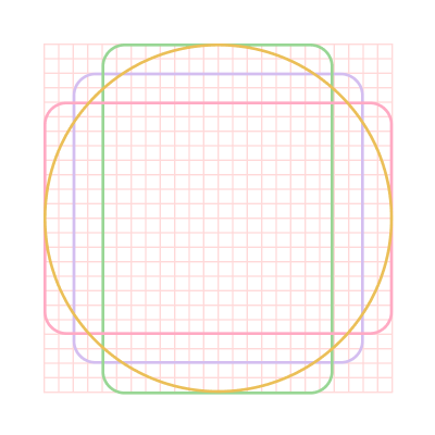


Responsive Design
Guidelines for responsive design were defined to support consistent behavior across different screen sizes, with a particular focus on mobile-first interfaces.
The section outlined key principles for how layouts should adapt across breakpoints, including grid structure and grid behavior. It also defined how components and layouts should respond to changes in screen size, ensuring predictable and consistent transitions between different viewports.
In addition, the guidelines covered aspects such as layout autonomy, aspect ratios, fixed base units, and panel behavior. These rules helped ensure that interface elements scaled and reflowed in a controlled and intentional way, rather than adapting inconsistently across products.
By establishing these principles, the framework supported more consistent responsive behavior and improved the overall usability of interfaces across devices and screen sizes.
UX Writing Guidelines
UX writing guidelines were defined to establish a shared foundation for how content and interface text should be written across products.
The guidelines cover core principles of UX writing, including the use of plain language, tone of voice, and avoiding unnecessary jargon. The tone of voice section defines what our tone should be, as well as what it is not, helping to create a clear and consistent writing style across all product touchpoints.
They also address how to write for different audiences, including both general users and domain experts, ensuring that content remains clear, appropriate, and accessible in context.
In addition, the guidelines include principles for formatting and structuring content, supporting readability and consistency across interfaces. This includes considerations such as hierarchy, scannability, and how information is grouped and presented within screens.
To support practical understanding, the guidelines are accompanied by examples demonstrating how they should be applied in real interface contexts. These examples show how the principles translate into actual UX writing decisions, helping teams understand how to use the guidelines in practice.
Our tone of voice is...
Our tone of voice is not...
User Research
To support more consistent use of user research across teams, a basic structure was defined for how research should be documented and where it should be stored, including a shared understanding of methodology.
Previously, research was often difficult to locate or scattered across different locations, which made it harder for teams to reuse existing insights and sometimes led to duplicated efforts.
To address this, efforts were made to consolidate user research into a single shared location, making it easier for teams to access and reuse findings. Guidance was also introduced to support more consistent documentation of new research.
Having a single shared location is a better approach as it minimizes duplication and improves access to existing insights across teams.
This helps teams build on existing knowledge rather than repeating previous work, improving alignment and making user insights more accessible across product development.
Product Specific Guidelines
Product-specific guidelines were defined to account for differences across the product suite, which includes a legacy desktop application, a newer web application, and a mobile application.
Designing across these platforms requires different considerations, as the conditions, constraints, and interaction patterns vary significantly between them. A single, uniform approach is not always appropriate, particularly given the differences in technical constraints and user context.
These guidelines document key product-specific factors to consider when designing for each platform, helping teams make more informed decisions and ensuring that solutions are appropriate for the context in which they are used.
Outcome
The outcome of the project was a UX framework approved by both stakeholders and team members, establishing a shared foundation for how user experience is approached across the department.
To support adoption and increase awareness, a digital seminar was conducted. The session focused on the role of user experience in software development and aimed to strengthen understanding of how UX contributes to building better products. It highlighted how UX influences product quality and decision-making, and why it should be considered throughout the entire development process rather than only at the end. This initiative helped extend UX awareness beyond the design team and encouraged a more user-centered mindset across disciplines.
Today, the framework is used as a shared reference point for development teams without dedicated UX support when seeking guidance on design decisions. It also serves as an onboarding resource for both new UX designers and developers, helping them understand how UX is integrated into the product development process.
In addition, it provides day-to-day support for the design team by offering clear principles and structured guidance for making consistent design decisions.
Technology
Design
Business
UX
Main Takeaways
- A UX framework is not a one-time deliverable. It requires ongoing maintenance, iteration, and refinement to remain relevant as products, teams, and needs evolve.
- Balancing depth and usability is a key challenge. A framework needs to provide enough detail to be useful while remaining structured and easy to navigate to avoid becoming overwhelming or fragmented.
- Achieving consistency across a product organization requires shared principles and tools. A common UX framework helps align teams over time by establishing a shared vocabulary for design decisions.
- A well-defined framework provides valuable support for design professionals by offering clear principles and guidance for making and communicating design decisions, leading to more consistent and confident outcomes.
- Design is increasingly moving beyond interface delivery and becoming a strategic driver of product adoption and experience quality, which highlights the need for shared frameworks that enable consistent UX decision-making across teams.