
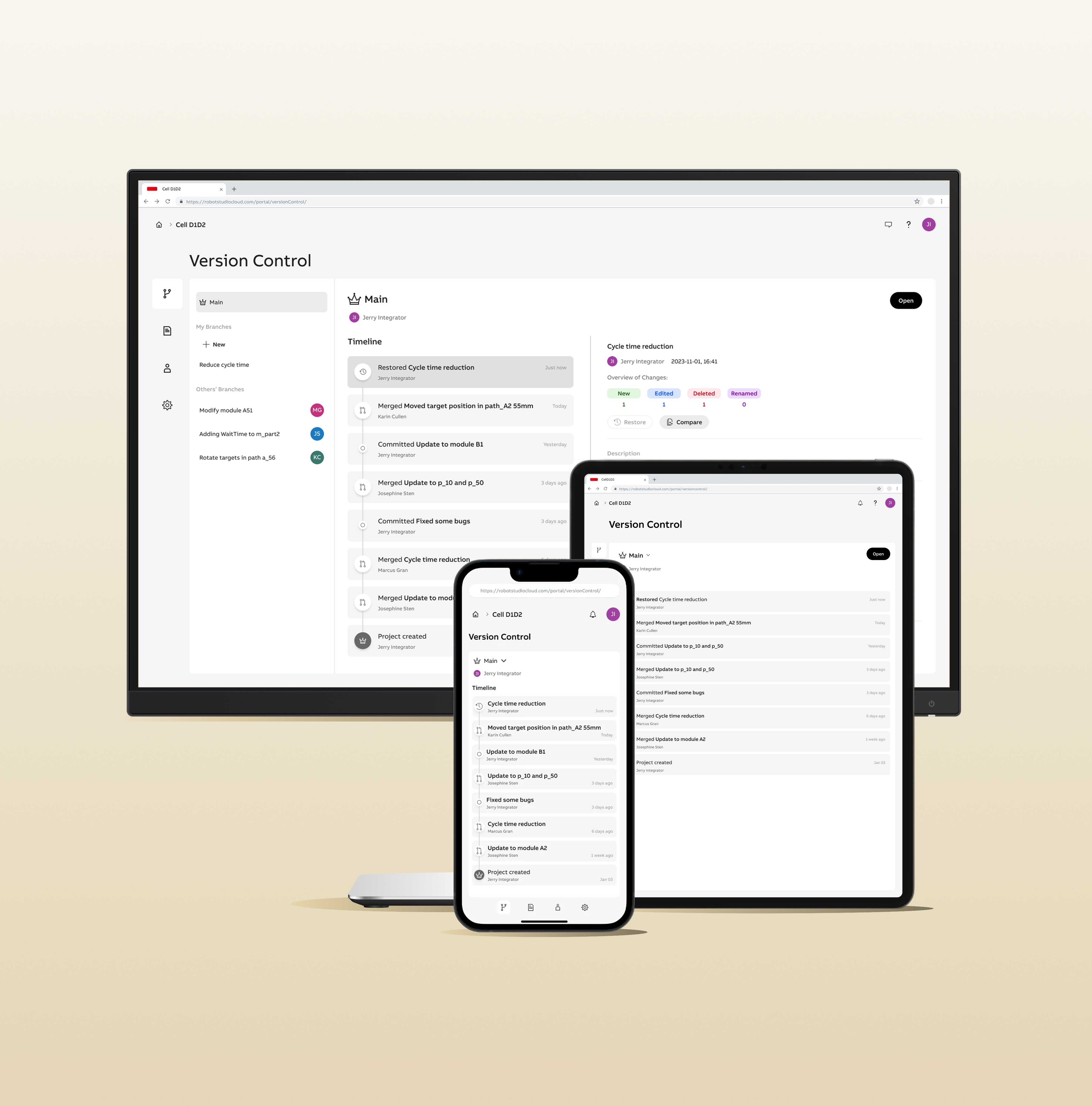
RobotStudio® Cloud
A collaborative online robot programming application.
ABB ROBOTICS
Research
UX
UI
User Testing
UX Strategy
Goal:
The goal of the project was to make offline robot programming accessible beyond a desktop-only context by exploring a web-based approach that could support both new and experienced users. The project also aimed to expand the product into a new business segment by introducing collaborative and version-aware workflows across web and desktop environments, while maintaining continuity with the existing software ecosystem.
Outcome:
The project resulted in the successful launch of RobotStudio® Cloud introducing a new product to the existing product suite of robot simulation software with over 60.000 users. The web-based application extends offline robot programming beyond a desktop-only workflow, and enables confident creation, simulation, and collaboration on robot simulation projects.
My Role
Responsible for end-to-end UX design of the web-based application, including UI design and user flow definition. This included designing cross-platform workflows between the existing desktop application and the new web experience. The role also covered planning and conducting beta testing with users prior to release, as well as close collaboration with developers throughout implementation to ensure design quality and feasibility.
Tool & Process
- Figma Design: UI design and interactive prototyping.
- Figjam: User flow and information architecture definition.
- Microsoft Forms: User surveys and beta testing.
- SAFe Methodology: Agile project execution through prioritized, task-based iterative development.
Overview
Project Aim
This project set out to address several critical needs faced by robot programmers during offline simulation and tuning workflows. The primary goal was to give users greater control over their progress, enabling safe experimentation and iteration without the risk of losing work. Another key objective was to enable seamless collaboration, allowing multiple colleagues to work on the same project simultaneously without relying on manual file exchange. The project also aimed to push the boundaries of the robot software industry by bringing offline robot programming to the web for the first time making it accessible from any device, anywhere. Finally, the solution focused on lowering the barrier to entry during the tuning phase of robot programming by delivering a simple, usability-driven web application tailored for modifying and refining robot programs in the later stages of a project.
Key Design Challenges
- Enabling robot programmers to track progress and changes throughout offline simulation projects.
- Designing a collaborative environment optimised for sharing work and resolving conflicts between multiple users.
- Introducing robot programming software to the web while maintaining continuity with the existing desktop software ecosystem.
- Adapting a complex, feature-rich application interface to remain usable and accessible across devices.
- Translating well-proven concepts from the software development domain (such as version control and collaboration) to the specific context of offline robot simulation.
Process


Sections
Click to navigate →
Research
Understanding the user journey
The domain of robotics is inherently complex. Many end customers looking to automate production rely on specialist system integrator companies to design and implement their production lines. As a result, system integrators are the primary users of robot simulation software, focused on delivering safe, reliable solutions that meet production targets efficiently.
To achieve this, system integrators use tools like RobotStudio to build virtual replicas of production cells and simulate solutions before deployment. Within these workflows, multiple roles collaborate closely, for example; mechanical engineers design hardware components such as conveyor belts and custom machines, while robot programmers develop the code that determines how robots move and perform their assigned tasks, ranging from pallet handling to arc welding.
Designing an effective application requires understanding what motivates users and identifying parts of the user journey that could be made more efficient. User research conducted prior to this project highlighted several challenges with the current way of working, which became the driving force for initiating the project:
Difficulty tracking changes throughout a project
Users frequently saved multiple versions of the same project to experiment freely without fear of losing work, but managing these versions was cumbersome and increased the risk of errors or lost progress.
Limited access across devices
Projects were typically stored locally, making it difficult to access work from multiple devices. Sharing large project files via email or other platforms was slow and error-prone.
Collaboration challenges
Large local files and manual sharing prevented multiple users from working on the same project simultaneously, leading to version conflicts and inefficiencies.
Complexity during the tuning phase
While the existing desktop application provides powerful offline programming functionality, its complexity can overwhelm users during the tuning phase. Users needed a simplified interface to efficiently edit, debug, and optimize robot programs without distraction from unnecessary features.
Persona
A primary persona was defined to help all project stakeholders, including designers and developers, develop a clear understanding of the target users who would ultimately interact with the application. This persona captured key characteristics, goals, and pain points of system integrators working with robot simulation software, highlighting their need for efficiency, control, and collaborative workflows.
The persona served as a reference point throughout the project, guiding discussions about which features to include, how workflows should be structured, and how the interface could best support users’ tasks. By anchoring design decisions in a real user archetype, the team was able to align cross-functional stakeholders and ensure the application was tailored to the practical needs and motivations of its end users.

The Robot Tuner

About
I work at a system integrator company, helping industrial companies to automate their production. I feel familiar with RobotStudio as I have been using it for a several years. On a typical day I am working with offline programming and simulation of robots, building new solutions for customers or helping them optimize existing solutions by reducing cycle time or updating robot paths according to new product versions.

Goals
- Feel confident when making changes.
- Track changes done to the robot program.
- Help the customers improve quality and production speed over time by tuning robot programs.
- Be efficient and fast.

Frustrations
- Fear of accidentally changing something without knowing it.
- Handling project versions is messy.
- Overwhelming amount of functions in the application not necessary when tuning the program.
- Time pressure.

What the user says
“Version handling is one of the negative sides to robot programming”
“Accidentally moving objects in the virtual station can result in real production stops if not noticed”
“Testing a new solution can be time consuming if it does not work and you have to return to the original solution”
“Managing multiple saved versions of the same project makes it unclear which version should be used moving forward”
Benchmark
At the time of the project, robot programming tools were technically powerful but often lagged behind other software domains in terms of usability and modern interface design. While robot programming is a specialised field, its workflows closely resemble conventional software development including writing logic, testing, iterating, and debugging.
User research revealed challenges that closely mirrored problems already solved in other domains through version control systems. These systems support tracking changes, safe experimentation, collaboration, and progress review. Similar principles have even been successfully adapted for non-programmers in tools such as Figma.
Encountering version control for the first time myself helped me empathize with users who were unfamiliar with these concepts. This experience directly informed design decisions, reinforcing the need to make version control functionality approachable, transparent, and easy to understand within the context of robot programming.
To explore how these concepts could be translated effectively, I benchmarked software across programming, 3D modelling, and file-sharing domains. This helped identify patterns, conventions, and trade-offs relevant to designing a collaborative, versioned workflow for robot programmers.
Key Insights:
- Complexity must match user expertise: While robot programmers are highly technical, many are unfamiliar with traditional version control systems. The solution therefore needed to be intuitive and approachable, avoiding unnecessary complexity while still supporting advanced workflows when required.
- Leverage established domain conventions, carefully: Version control systems rely on well-established terminology and interaction patterns. Concepts such as branch, commit, merge, and master/main appeared consistently across the majority of benchmarked tools. Reusing familiar conventions can help experienced users quickly orient themselves and recognise established workflows.However, this comes with a trade-off as users new to version control may find this vocabulary intimidating or unclear. This insight highlighted the need to balance technical accuracy with clarity, potentially through more descriptive language, progressive disclosure, or contextual guidance, to ensure accessibility without sacrificing consistency.
Design
Define main user flows
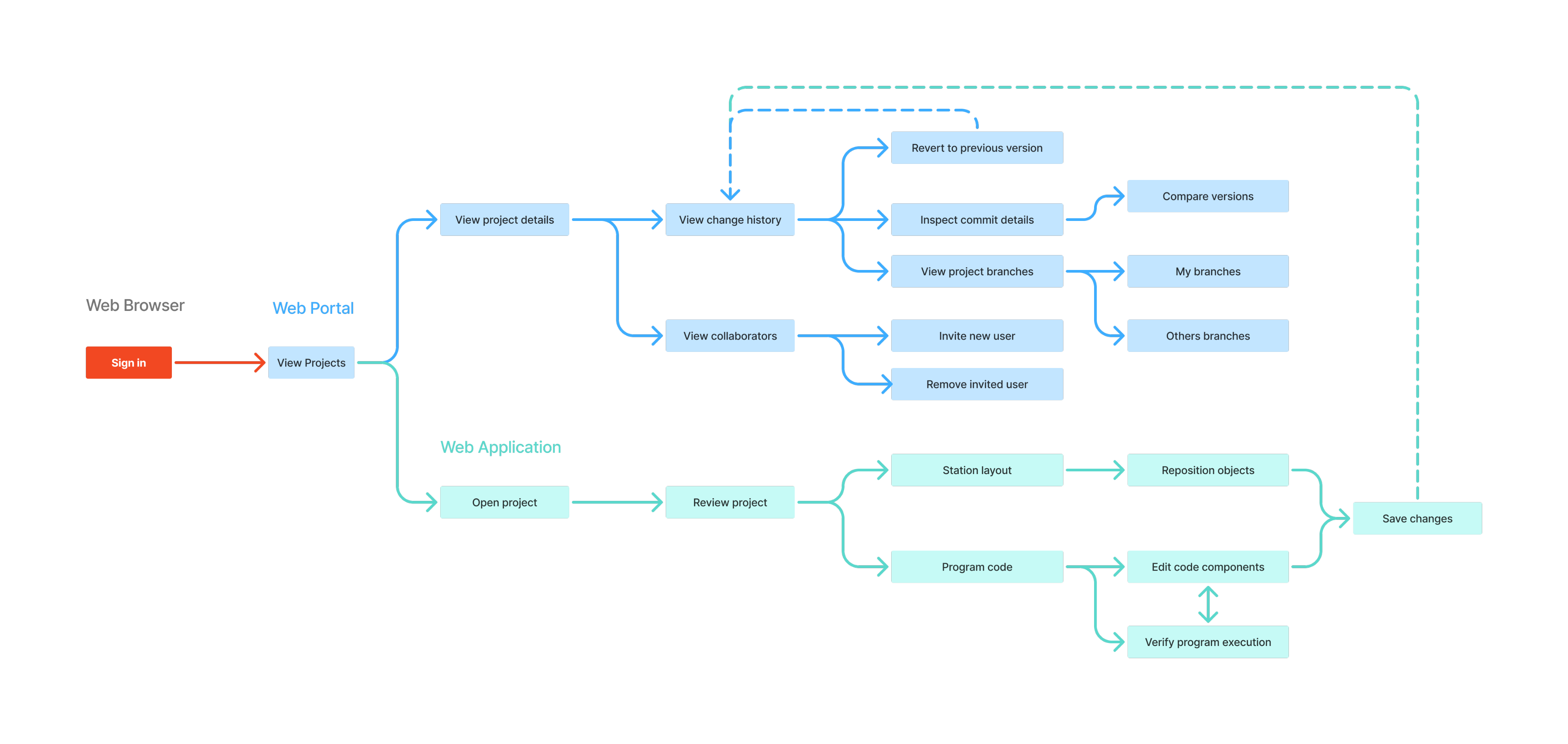
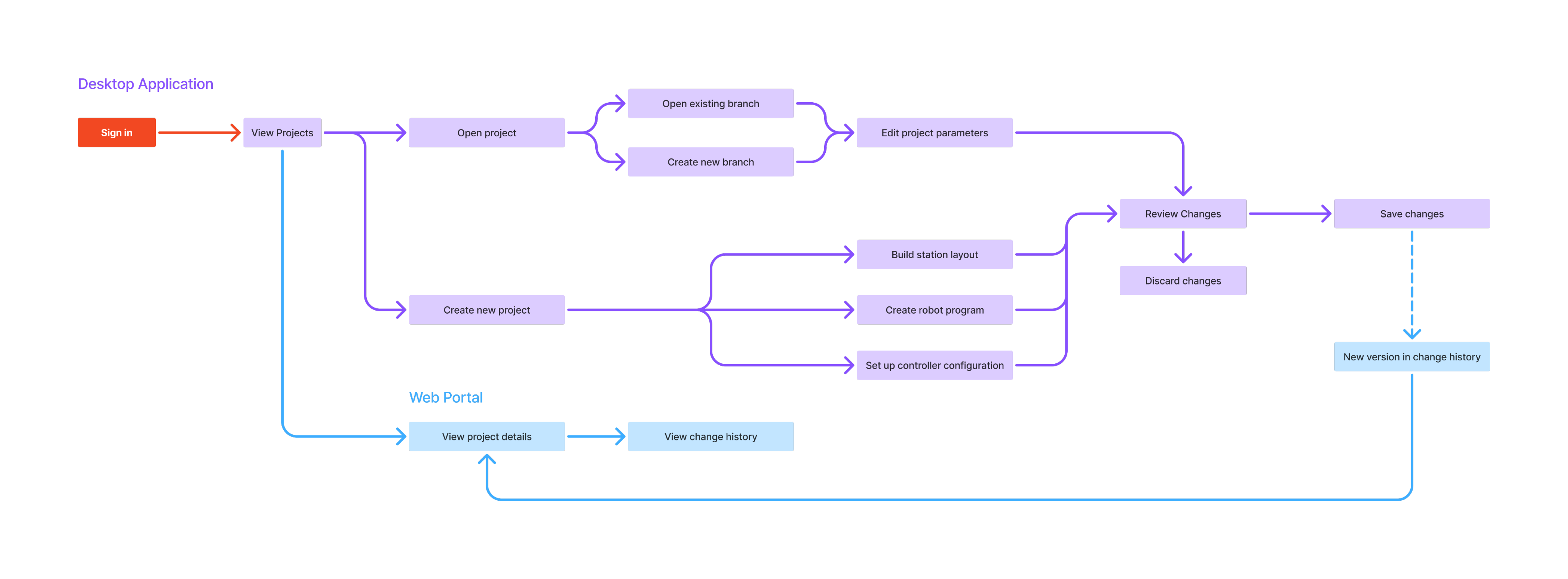
This project introduced a new web application intended to complement an existing desktop product while also delivering standalone value. A key part of the design process was defining the main user flows to understand how users should move between the two environments, what tasks belonged where, and how transitions could feel seamless rather than disruptive.
One of the central challenges was introducing version control as a new capability across the product ecosystem. At the time, users relied largely on manual file handling to manage iterations and collaborate, which often led to confusion and duplicated work. Defining the user flows therefore involved exploring how version control concepts could be integrated into existing desktop workflows while leveraging the web application as a space for broader oversight and collaboration.
User flow mapping suggested positioning the desktop application as the primary space for hands-on programming tasks, such as building the station environment and iterating on robot programs. The web application was explored as a complementary layer for higher-level activities later in the project lifecycle, including tuning robot program for optimization, reviewing change history, managing branches, and administering collaborators. Establishing these boundaries helped clarify when users should remain in the desktop context and when it was more appropriate to transition to the web experience.
Main activities per platform
Web Portal
- View projects
- Open project in web app
- Open project in desktop app
- Delete project
- Download project locally
- Share projects
- Invite user
- View invited users
- Remove invited user
- View project details
- View change history
- Compare project versions
- View branches
- Create branch
- Edit project
Web Application
- Open a project
- Review project
- Station layout
- Program code
- Run simulation
- Verify execution
- Control cycle time
- Edit project
- Reposition program points
- Change instruction arguments
- Edit program logic
Desktop Application
- View projects
- Open main branch
- Create new branch
- Create new project
- Build station layout
- Create robot program
- Set up controller configuration
- Edit project
- Make changes
- Review changes
- Save changes
- Get notified about other users changes
- Stay in tune with main branch
- Merge branch to main
- Update branch from main
Main user flow - Web
Main user flow - Desktop
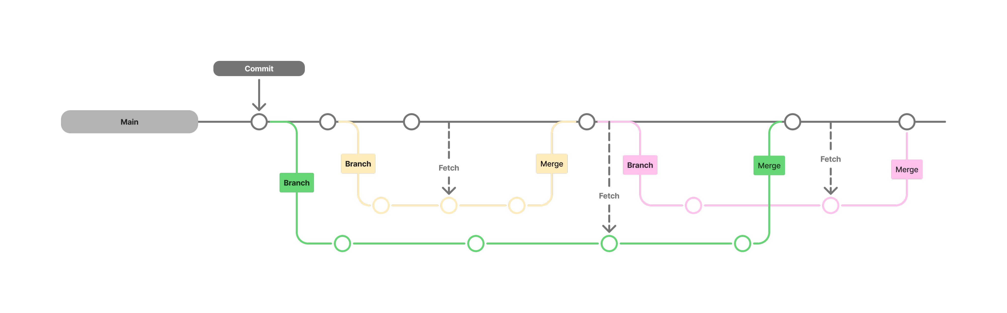
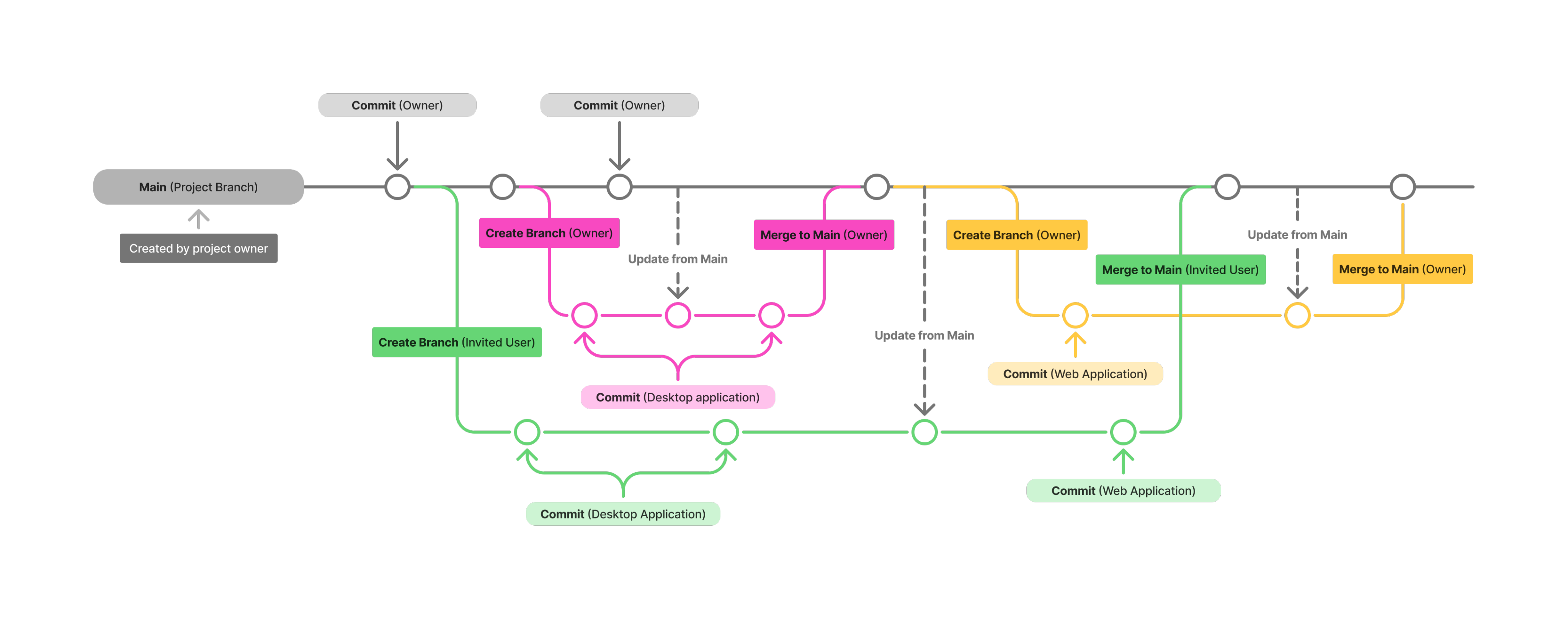
Defining the collaboration flows required careful consideration of user roles and permissions. Key decisions focused on balancing openness and collaboration with control, transparency, and project integrity, ensuring multiple users could contribute without risking accidental overwrites or loss of ownership.
Two user roles were defined: Owner and Member:
- The Owner is the user who creates and owns the project and has full control over it.
- A Member is a user invited to collaborate on the project.
The primary distinction between these roles lies in how changes are made and managed. Owners can edit the main project branch directly, while Members must first create their own branches to make changes. These changes can then be reviewed and merged back into the main branch.
This approach allows multiple users to work on the same project in parallel while maintaining a single source of truth. It ensures that contributions are transparent, clearly showing who made which changes and when, while enabling safe experimentation without compromising the stability of the main project.
Version control concept
Impact:
Insights from the pre-study helped distinguish which flows and functionalities were essential for delivering core value in the first release and which could be introduced in later iterations. These prioritisation decisions were made in close collaboration with stakeholders from design, engineering, and business to ensure alignment between user needs, technical feasibility, and business objectives.
This structured approach ensured that the first release delivered meaningful value from day one, while leaving clear pathways to extend functionality in future iterations according to the project roadmap.
Information Architecture
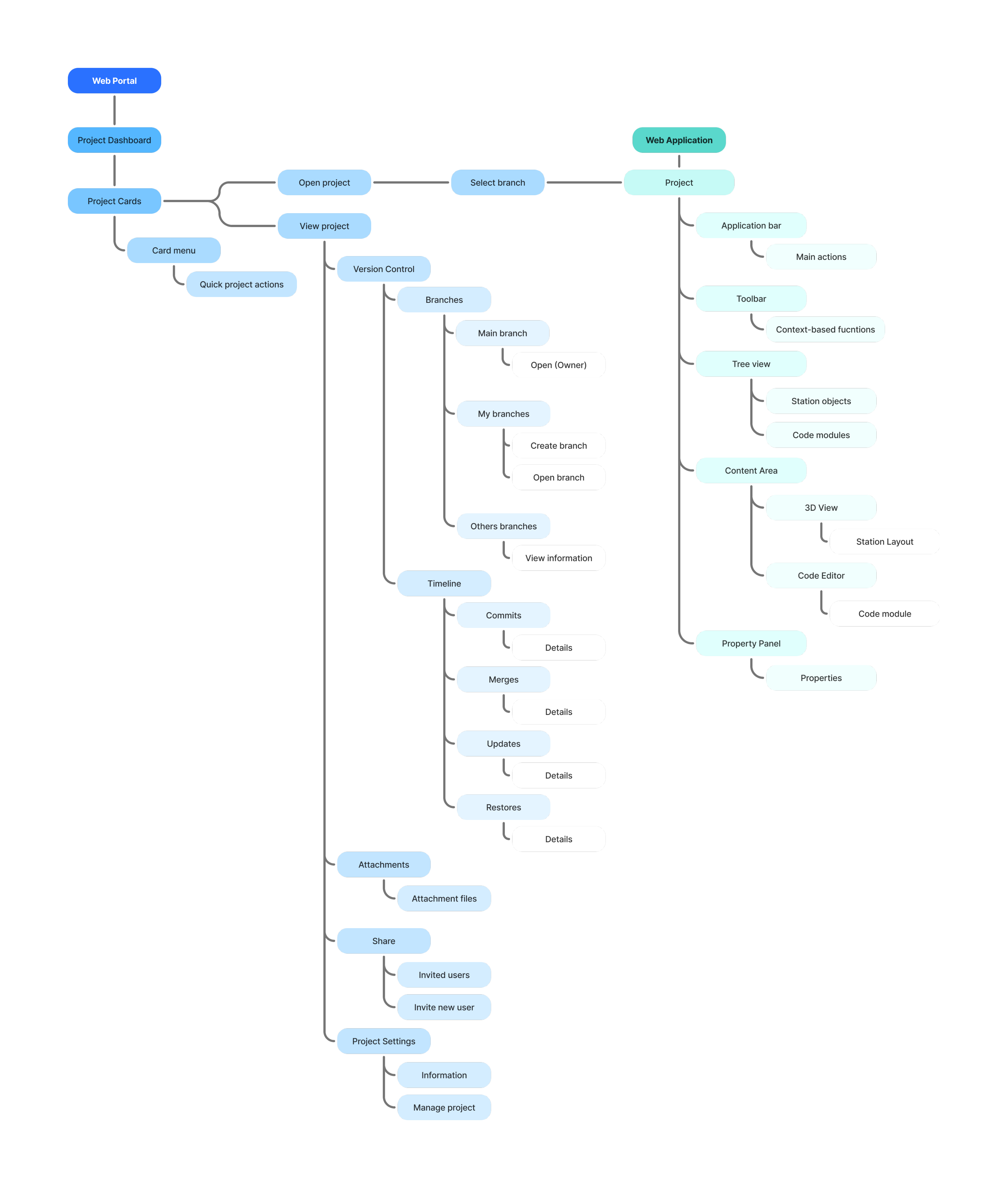
The first step was to define the structure of the new web application, including the main pages and how users would navigate between them. It was important to establish the overall layout, determine the placement and behavior of the main navigation, and create an initial plan for how different functions should be organized and triggered. This helped ensure that the application would be intuitive, consistent, and aligned with user workflows from the start.
Once the high-level structure was reviewed and agreed upon by stakeholders, detailed design work could begin. Aligning on architectural decisions before moving into interface design helped reduce uncertainty, avoid costly changes later in development, and provided a solid foundation for iterative design and delivery.
Site Map (simplified)
UI Design Iterations
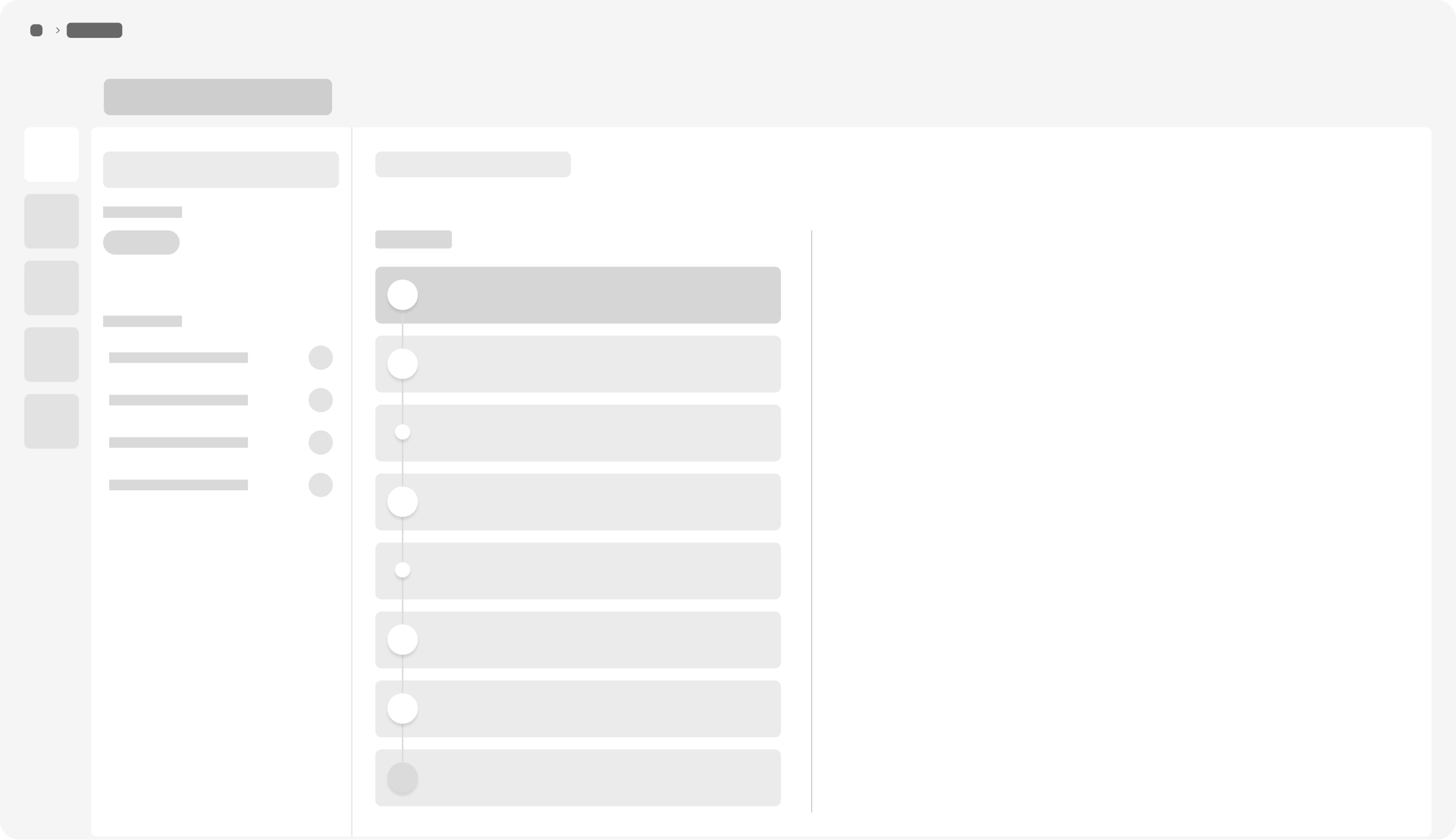
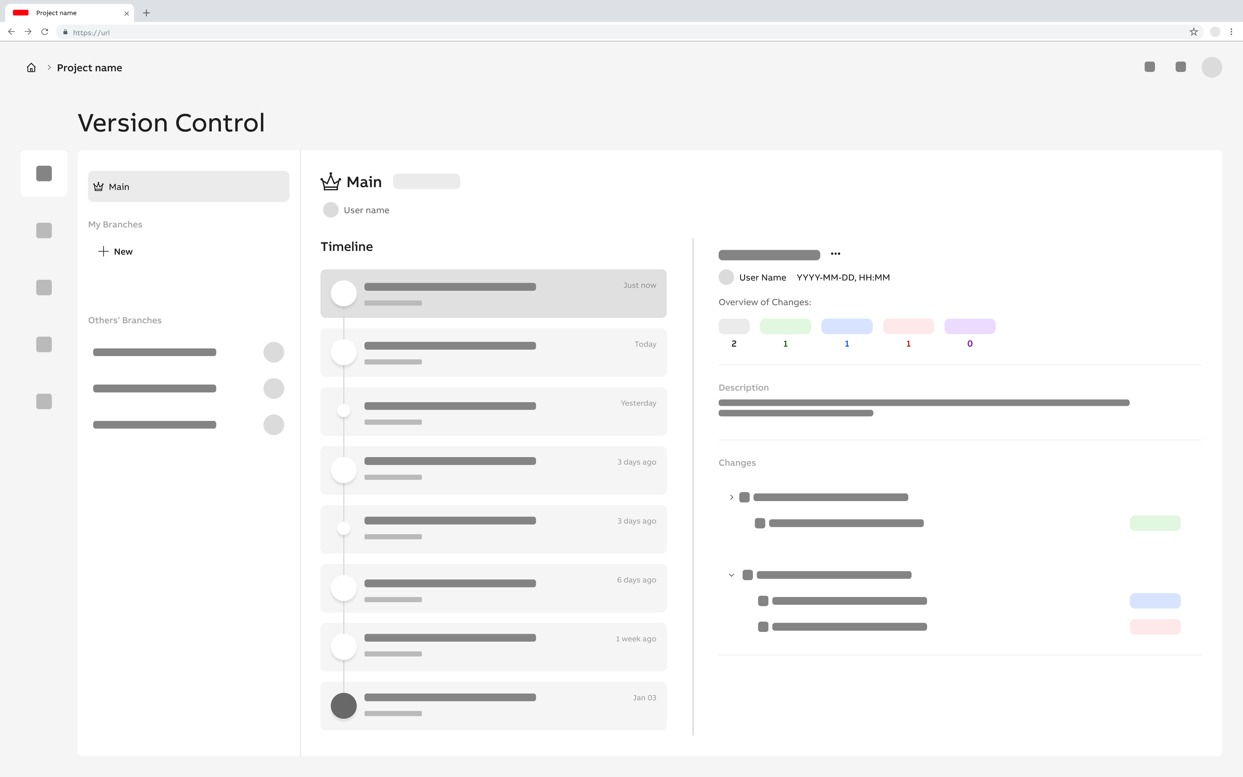
The project progressed through multiple design iterations on the path to a final solution. Given the scope and complexity of the UI work, an agile approach was adopted, breaking the product down into feature-level design tasks. Each feature was defined by clear goals and requirements and explored individually, allowing focused design efforts while maintaining momentum across the broader system.
With the main views established in the sitemap, their core structure was outlined through lo-fi and mid-fidelity sketches. This created a shared baseline before moving into detailed user flows and interface design. At this stage, the focus was on defining key layout principles, such as navigation placement, hierarchy of primary content, and how more detailed information should be accessed. The sketches enabled rapid exploration of alternatives and served as a tool to facilitate alignment with stakeholders before committing to higher-fidelity designs.
While individual features were explored independently, they were continuously evaluated within the context of the overall system. As new insights and dependencies emerged, earlier decisions were revisited and refined to ensure cohesion across the product. This iterative back-and-forth was essential in maintaining consistency and accommodating requirements that surfaced later in the process.
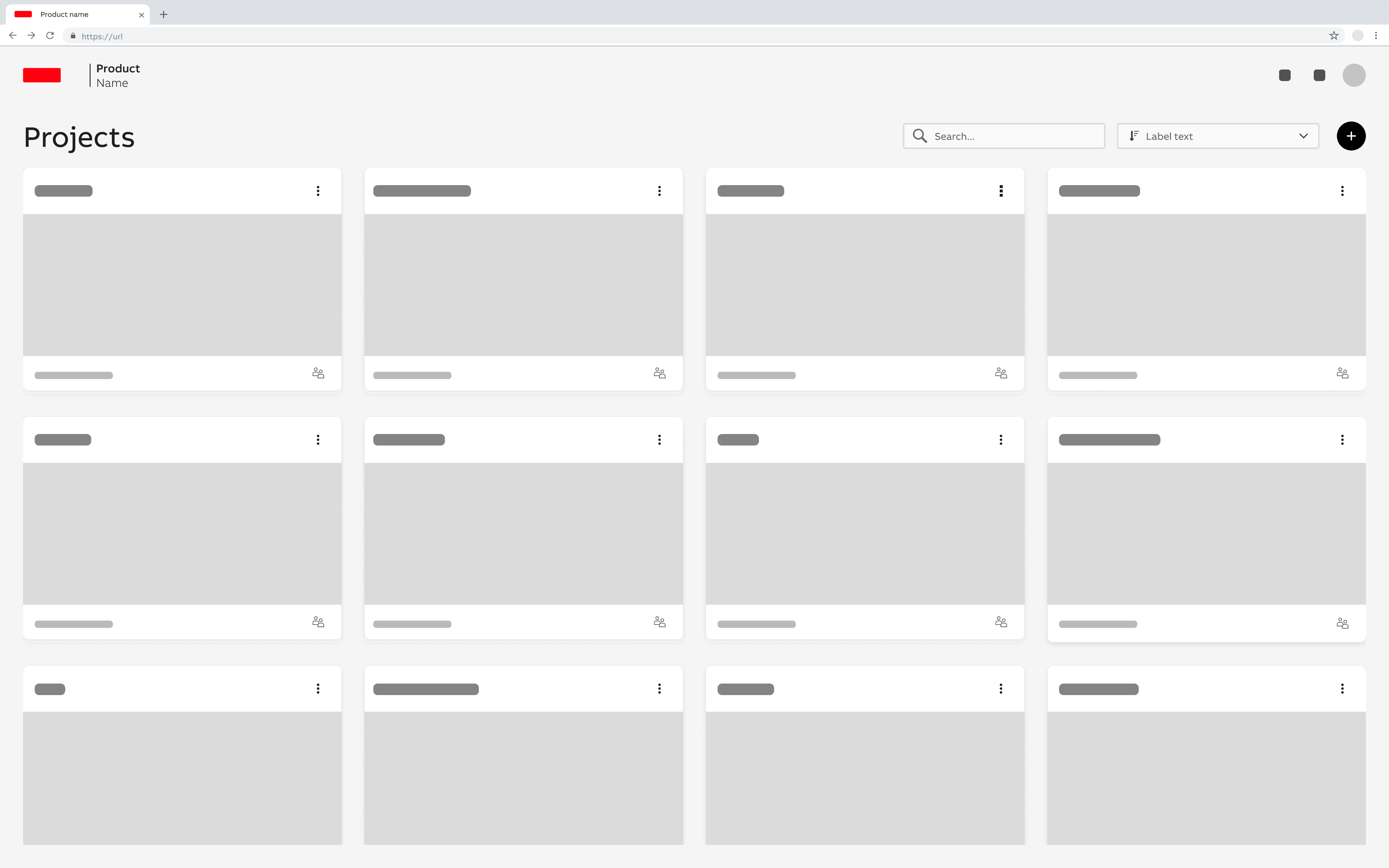
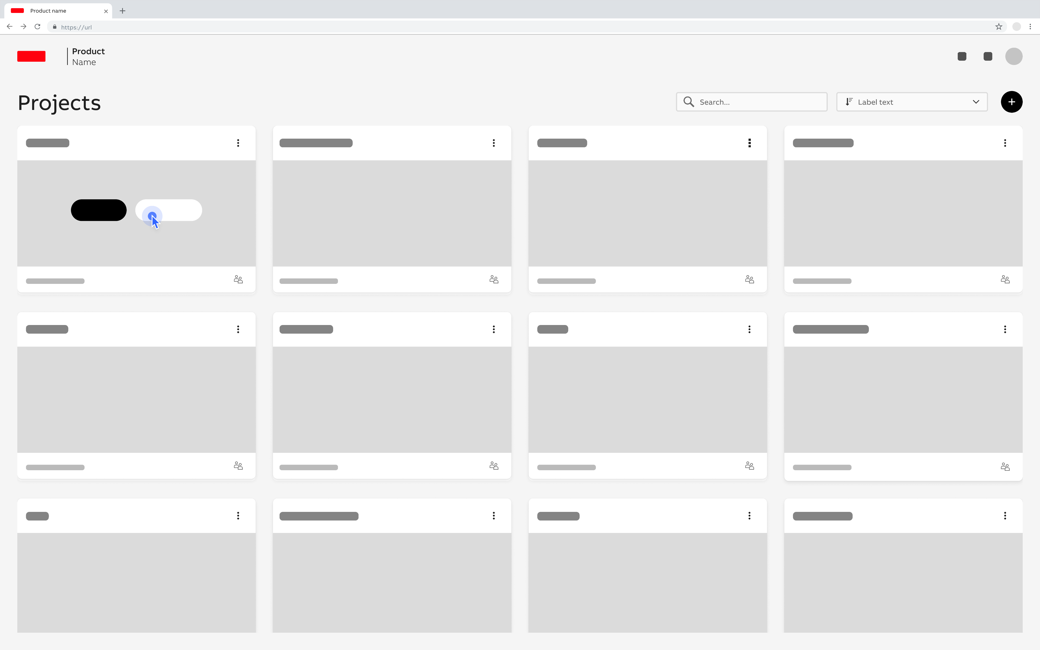
Two key considerations guided the design phase: responsive design and developer handoff. All UI designs needed to adapt seamlessly across screen sizes, from desktop to tablet and mobile. With no established company guidelines for responsive web design, foundational patterns were defined as part of the project. This included establishing breakpoints, spacing and padding systems, content flow patterns, and designing mobile-specific, touch-friendly components.
Responsive design was treated not only as a layout challenge, but as a contextual one. Different devices supported different user needs: desktop users were more likely to perform complex project management and version control tasks, while mobile users typically required quick access to updates or lightweight interactions. As a result, content prioritization, UI density, and available actions were adapted to suit each context.
To support implementation, detailed design annotations were provided to communicate how components should scale, shift in prominence, and adapt behavior across breakpoints, ensuring a smooth and well defined developer handoff.
Responsive Design
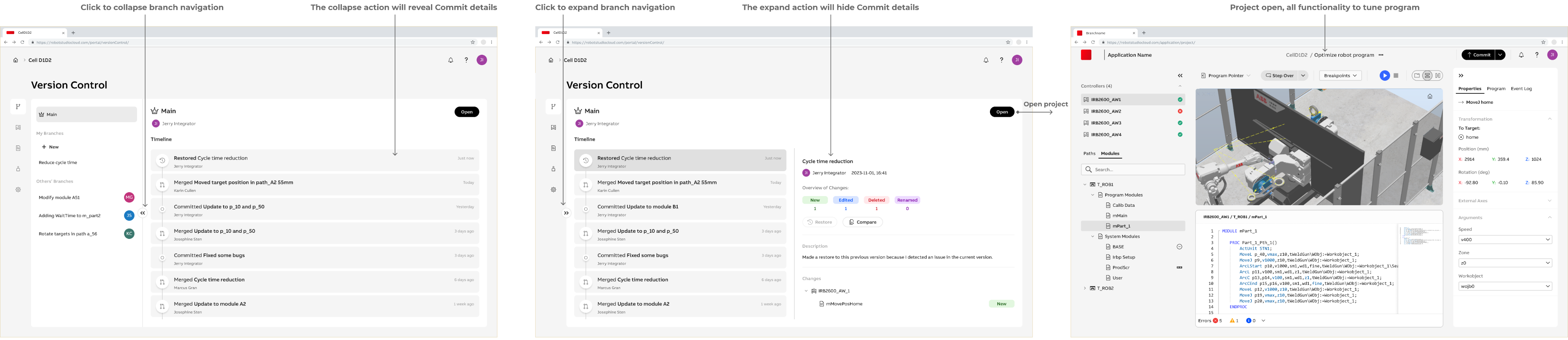
Large - Laptop
The UI at the large breakpoint has all options enabled, equivalent to the XL display. The main difference is that the user must switch between content areas using expand and collapse functionality.
- Since all content cannot be displayed at the same time, the UI supports easy alternation between page navigation and content inspection through a single click.
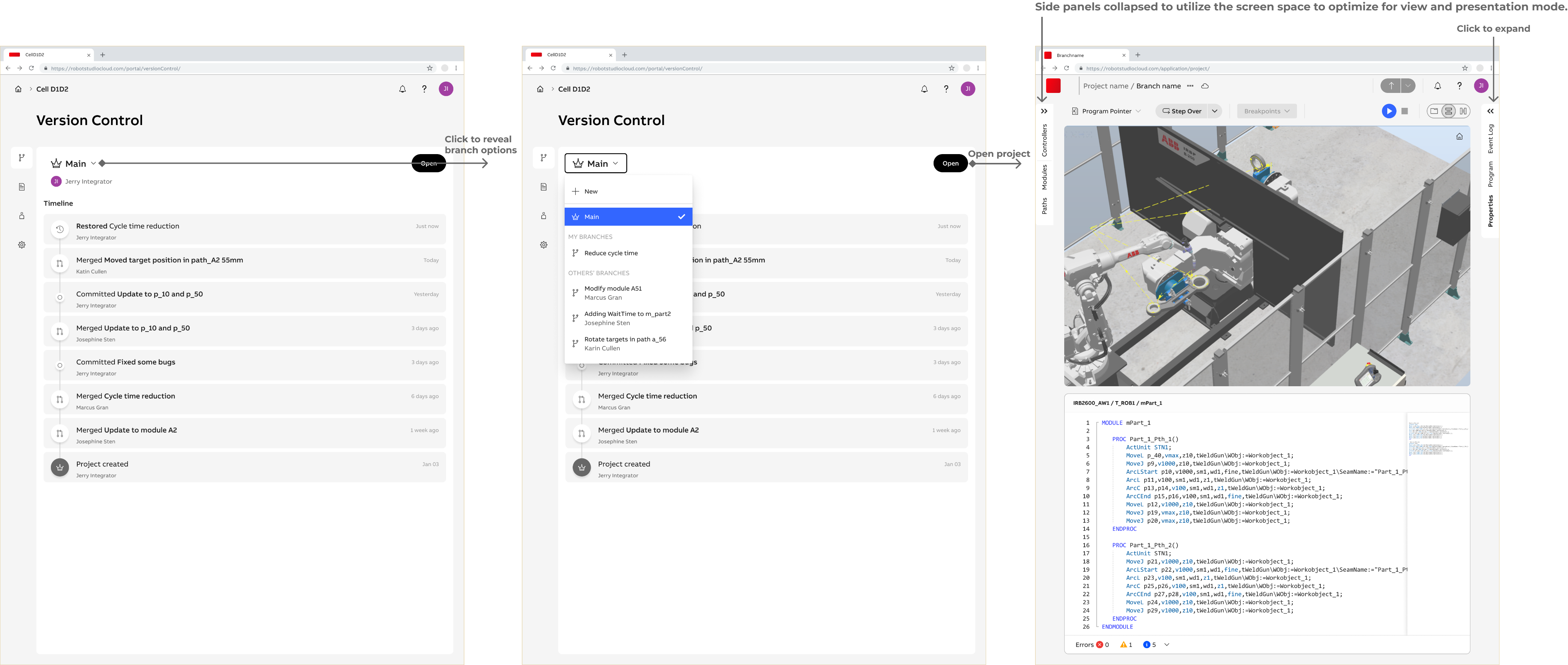
Medium - Tablet
The UI at the medium breakpoint has is primarily intended for viewing, with a limited set of enabled operations. Users can view the main branch, their own branches, and branches created by others. They can also open the project in the web application to view or present the project.
- The timeline for tracking changes is the default view. From there, the user can navigate to other pages and features.
Small - Mobile
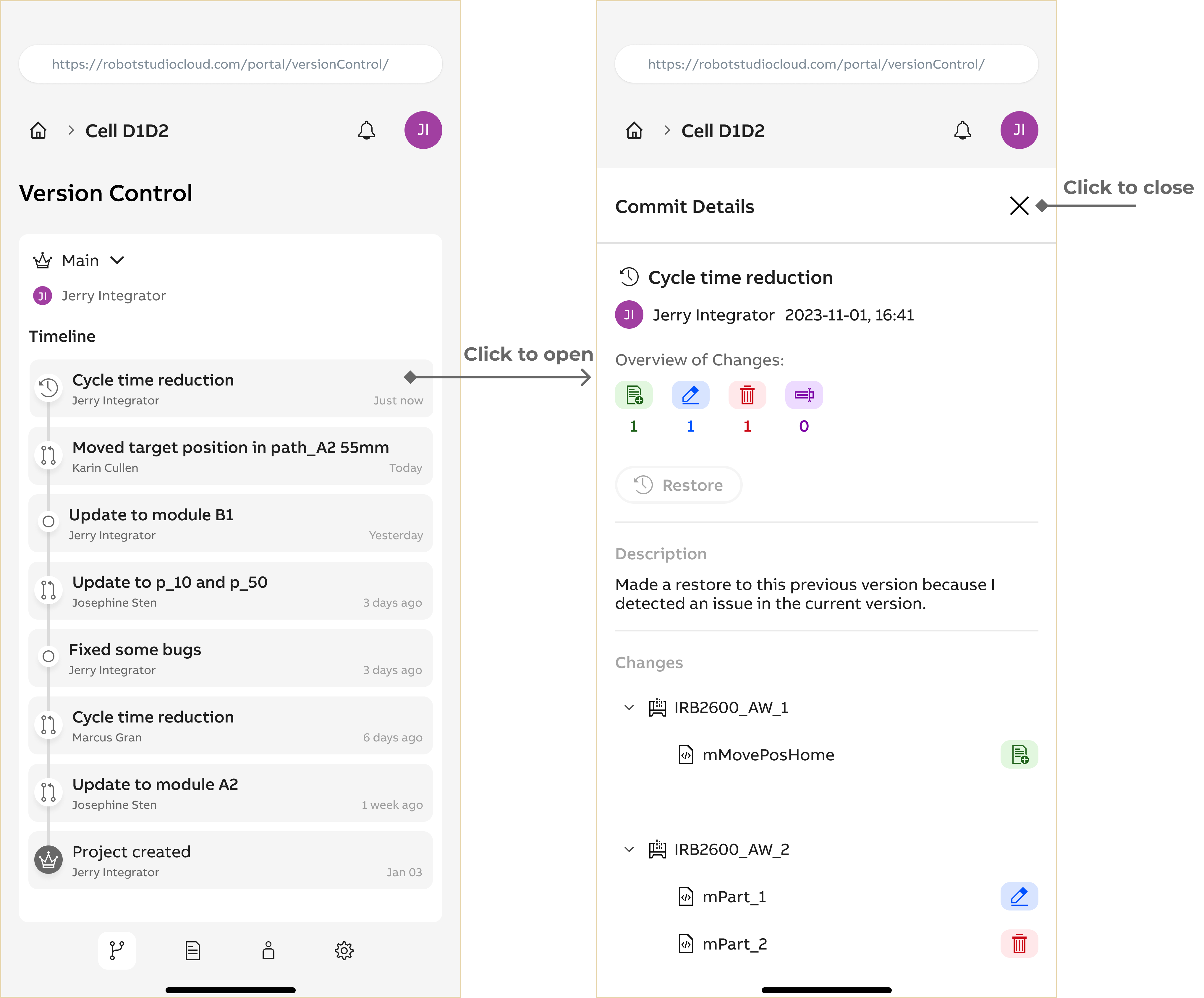
The UI for the small breakpoint has a view only purpose. Restore is the only available action allowing error recovery.
- Content has to be presented in different views.
- User can navigate to discover more details if needed.
Design Specification
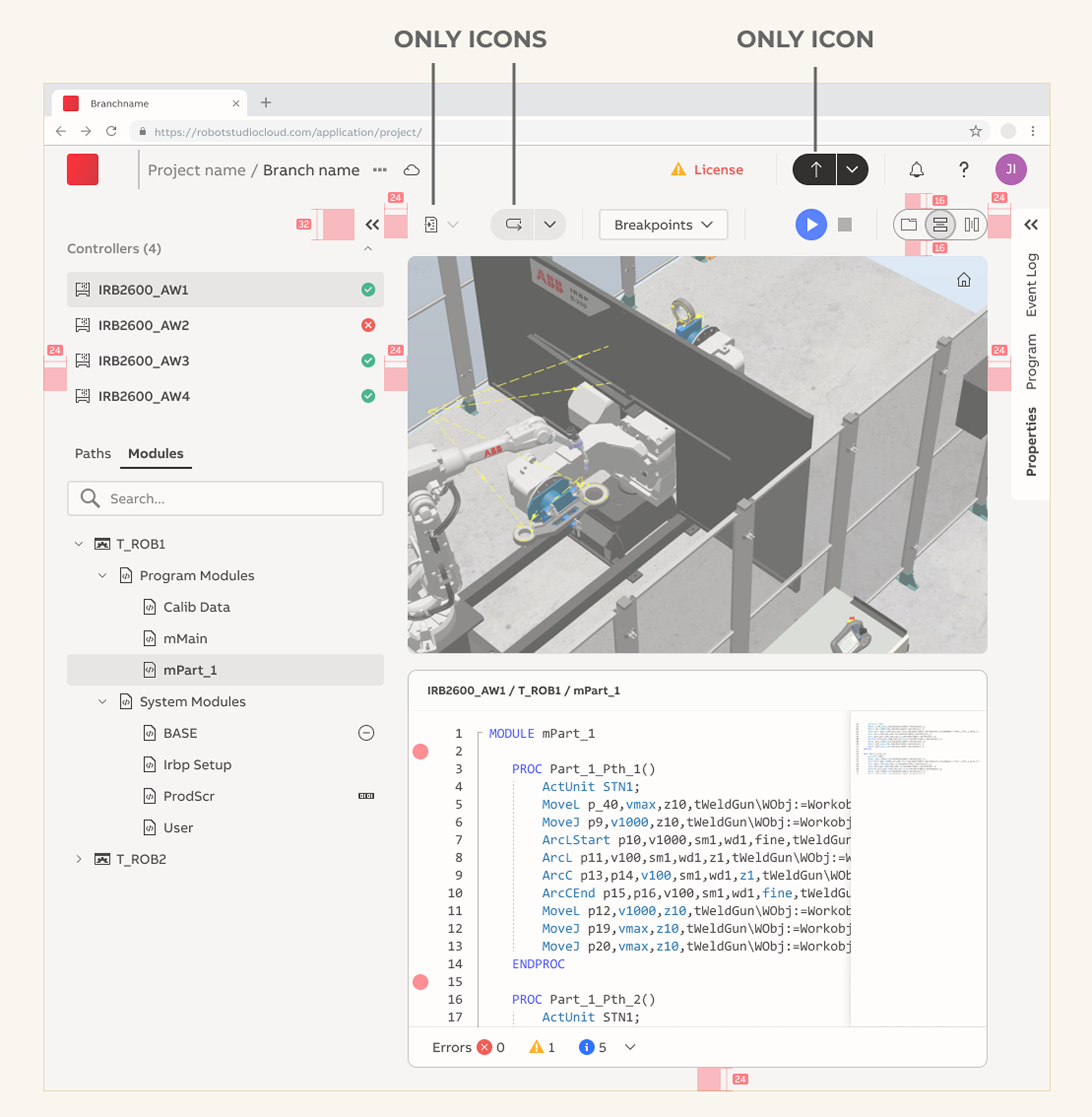
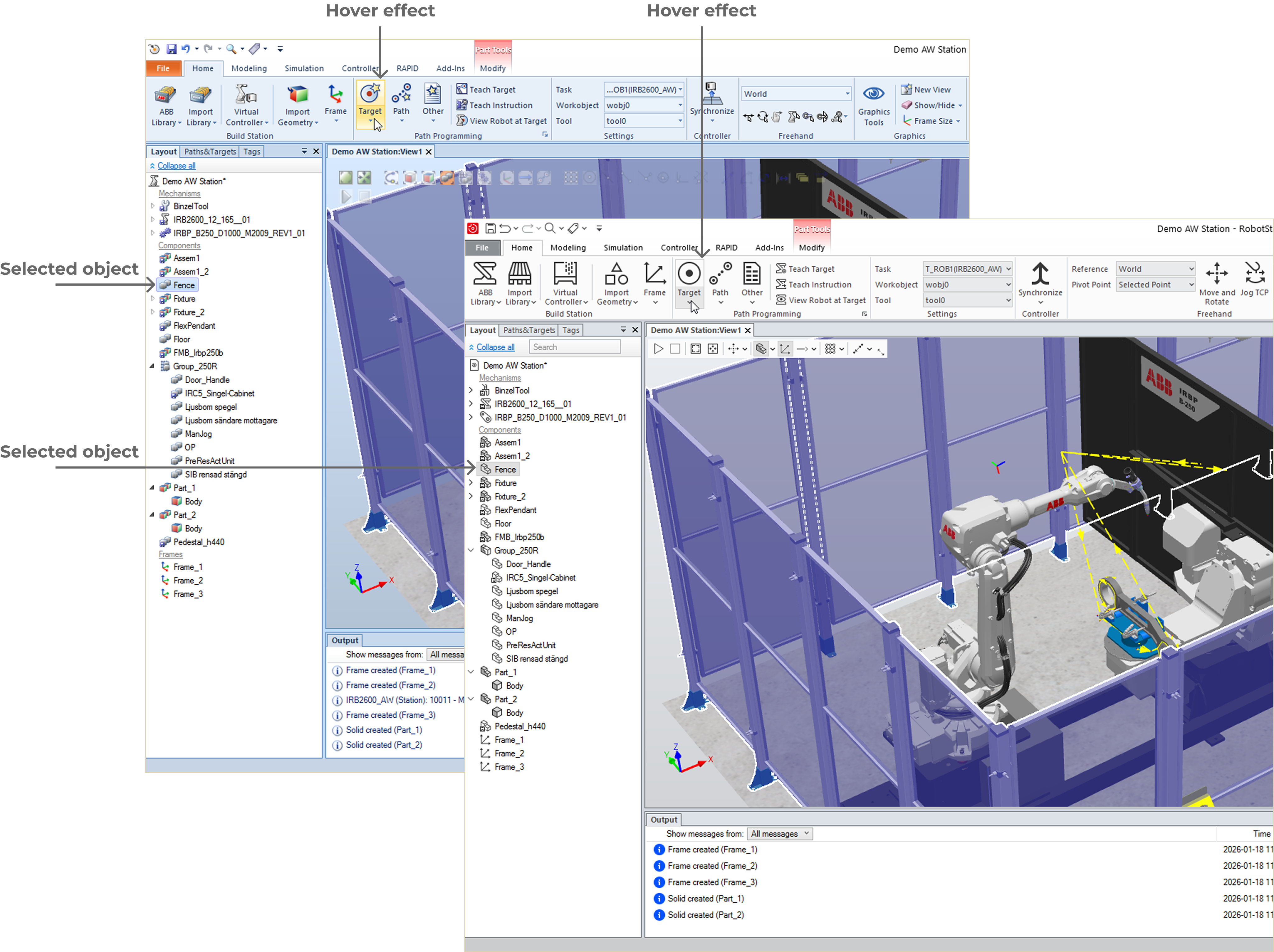
Another significant challenge was maintaining consistency across two applications with different design systems. The legacy desktop product followed a Microsoft-influenced visual style, while the new web application was based on a cleaner, monochrome interface aligned with the company’s updated design system. A key goal was to ensure that both applications felt like part of the same product family, especially for shared concepts such as version control, including creating branches, reviewing and committing changes, and viewing the project dashboard. Aligning interaction patterns, visual cues, and terminology helped reduce cognitive load and enabled a more seamless cross-platform experience.
The introduction of version control introduced new functionality that required clear and recognizable iconography. Because these icons needed to work across both desktop and web applications, aligning the visual language between platforms became a strategic UX requirement rather than a purely visual task. The existing icon set in the desktop application was outdated and lacked consistency, which presented an opportunity to modernize the iconography and establish a shared, scalable icon system. This update helped ensure visual consistency across products, supported future feature expansion, and reinforced a cohesive user experience across the broader software ecosystem.
UI Alignment
Realization
Implementation support
During the project, detailed design specifications were created and handed over to development at a feature level. The work followed an agile delivery model aligned with the SAFe framework, with incremental planning and continuous refinement throughout the development cycle.
The final implementation involved multiple development teams working in parallel on different parts of the product. This required ongoing collaboration with engineers, product managers, and other stakeholders across several product teams. As the UX designer, I maintained continuous dialogue to clarify design intent, respond to technical constraints, and support decision-making as features moved from design into implementation.
Close collaboration helped ensure that the implemented solutions were technically feasible, met functional requirements, addressed user needs, and remained consistent across both the desktop and web platforms. By staying closely involved throughout implementation, design decisions could be validated, adjusted, and aligned with technical realities without compromising the user experience or delivery timeline.
Beta user Testing
Before the official release, a group of users took part in beta testing, providing feedback on usability, workflows, and overall functionality. The goal was to verify both the technical readiness of the application and whether it met user expectations and needs. Feedback was collected through surveys and follow-up interviews to capture first-time experiences and uncover deeper insights.
The beta testing process included several key phases:
- Introduction Meeting: Users were introduced to the software, its main functionality, and intended use cases.
- Testing Phase: Users explored the beta application on their own time, experimenting with features, discovering capabilities, and identifying potential bugs or areas of confusion.
- Survey: Captured initial impressions, usability perceptions, and overall sentiment.
- Follow-Up Interviews: Explored the reasoning behind users’ initial experiences, highlighting what worked well and identifying areas for improvement.
This structured beta testing approach allowed the team to identify friction points and refine key interactions, ensuring the product was both reliable and intuitive at launch. The insights from beta testing directly informed prioritization decisions for the initial release and established a feedback-driven foundation for the product’s ongoing evolution.
Product Release
Being part of the product’s journey from initial concepts and design specifications to a fully functional software application was both exciting and rewarding. Being involved throughout the process allowed me to ensure the product met user needs, delivered a seamless experience, and stayed true to the design vision. Close collaboration with developers, product management, and other stakeholders helped address last-minute challenges and contributed to a smooth and successful launch. he release of this new web-based software added value to the already well known and used product suite of robot simulation software with over 60.000 users.
Outcome
The project resulted in the launch of RobotStudio® Cloud, a new web-based product within the RobotStudio® Suite. The application allows users to confidently create, simulate, and collaborate on robot simulation projects, extending offline robot programming beyond a desktop-only workflow. Key outcomes:
- Cross-platform collaboration: Users can now work together on the same project in real time and manage versions through branches and a shared history
- Accessible from any device: Projects can be accessed from desktops, tablets, and mobile devices, supporting different contexts of use.
- Simplified user experience: The web application focuses on ease of use, particularly for the tuning phase, while maintaining continuity with the existing desktop software.
- Validated through beta testing: Iterative user feedback ensured that workflows were intuitive, version control was understandable, and the product addressed real user needs.
The release of RobotStudio® Cloud represents a step forward in making offline robot programming more flexible, collaborative, and user-friendly, opening new possibilities for system integrators and robot application specialists.
Key Design Views
Web Portal - Dashboard
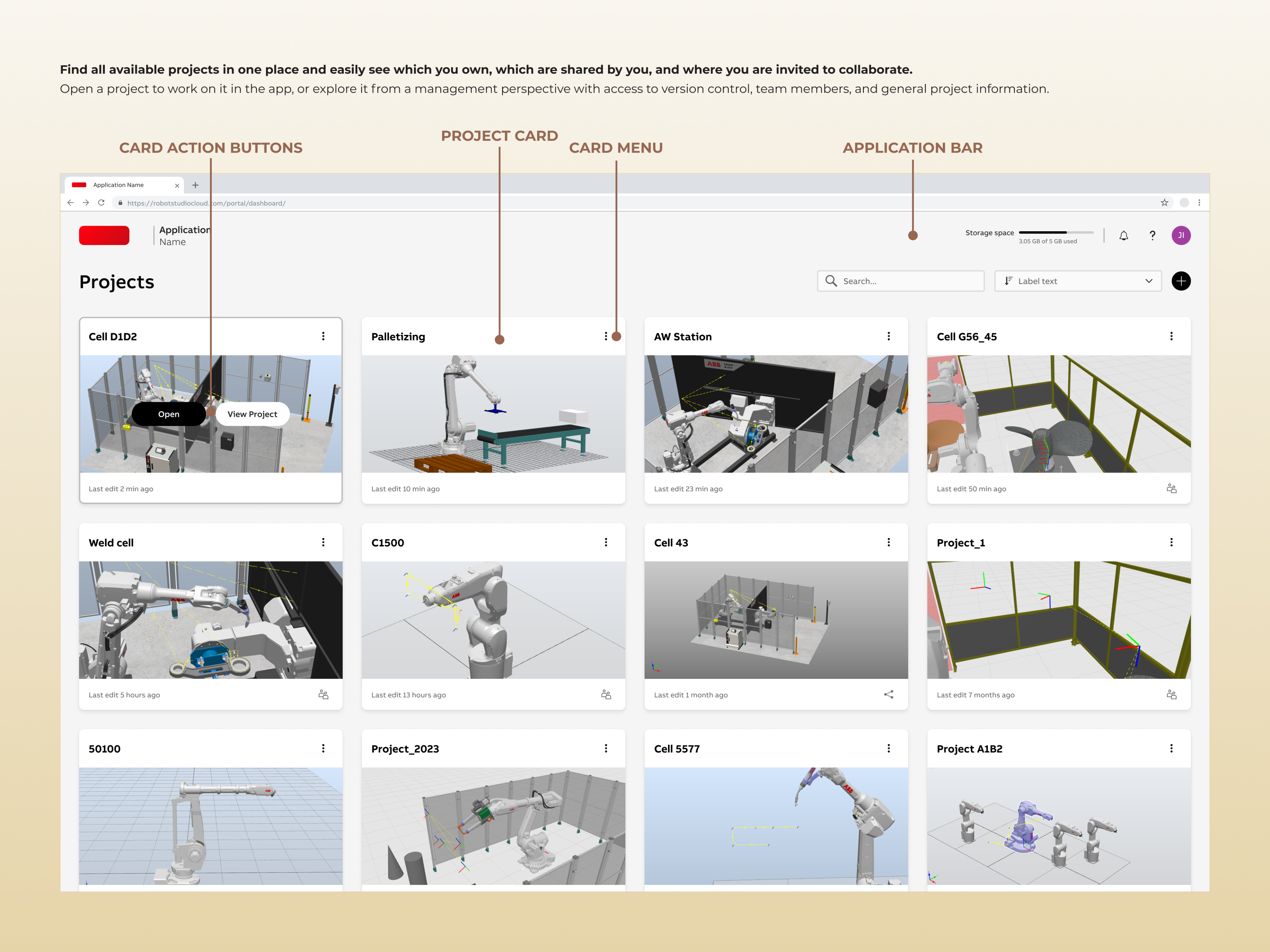
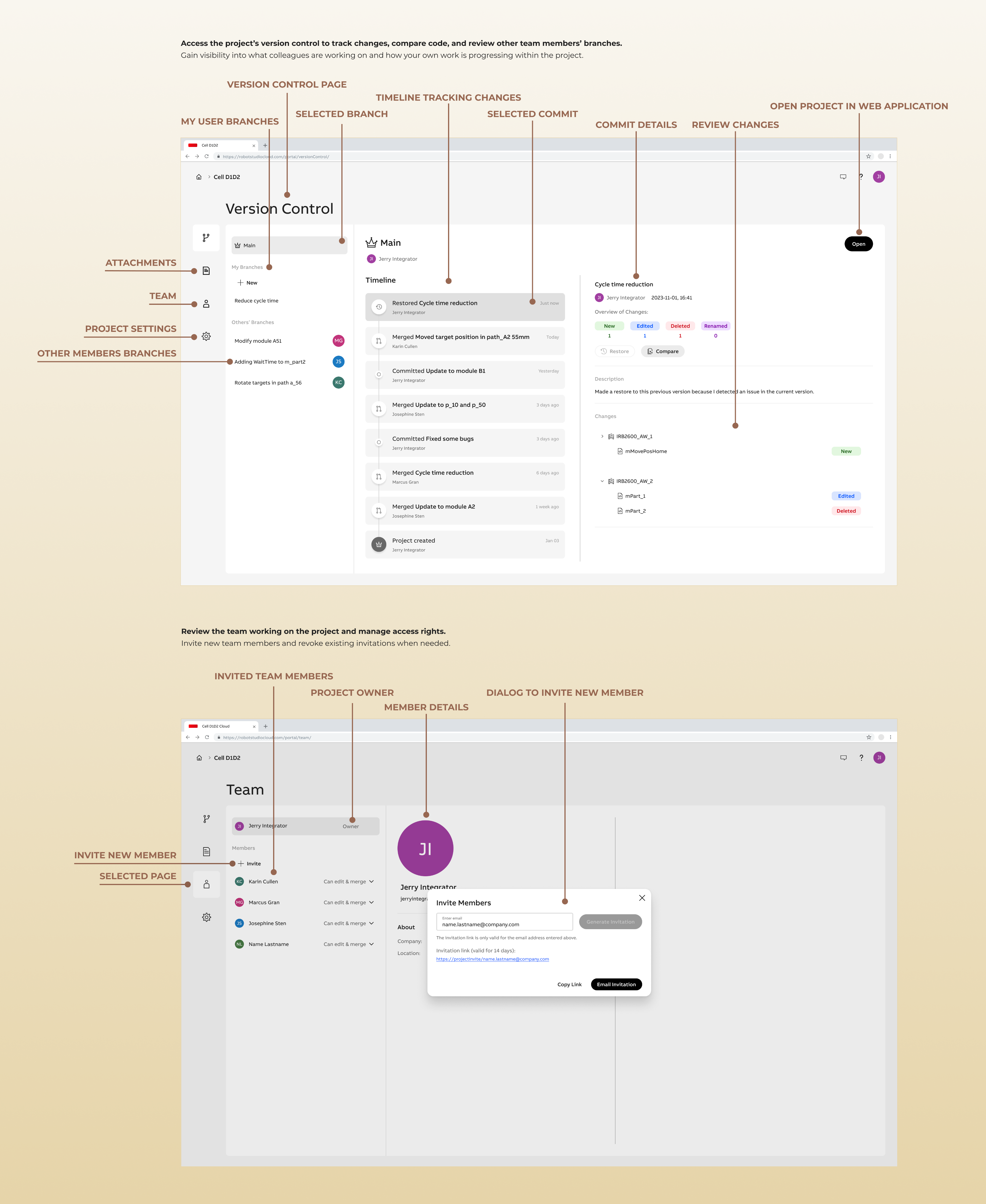
View Project - Version Control and Team View
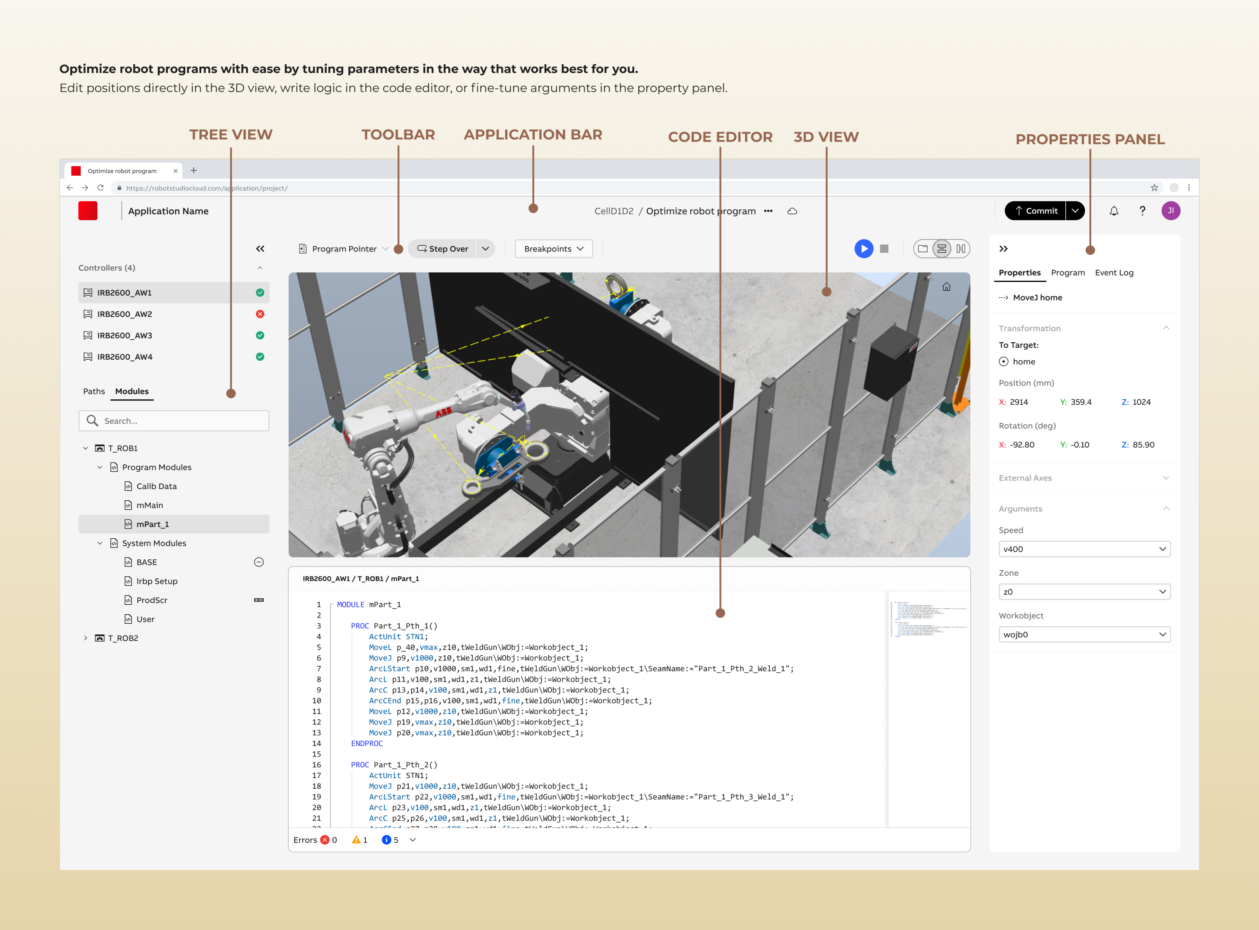
Web Application - Tuning Robot Program
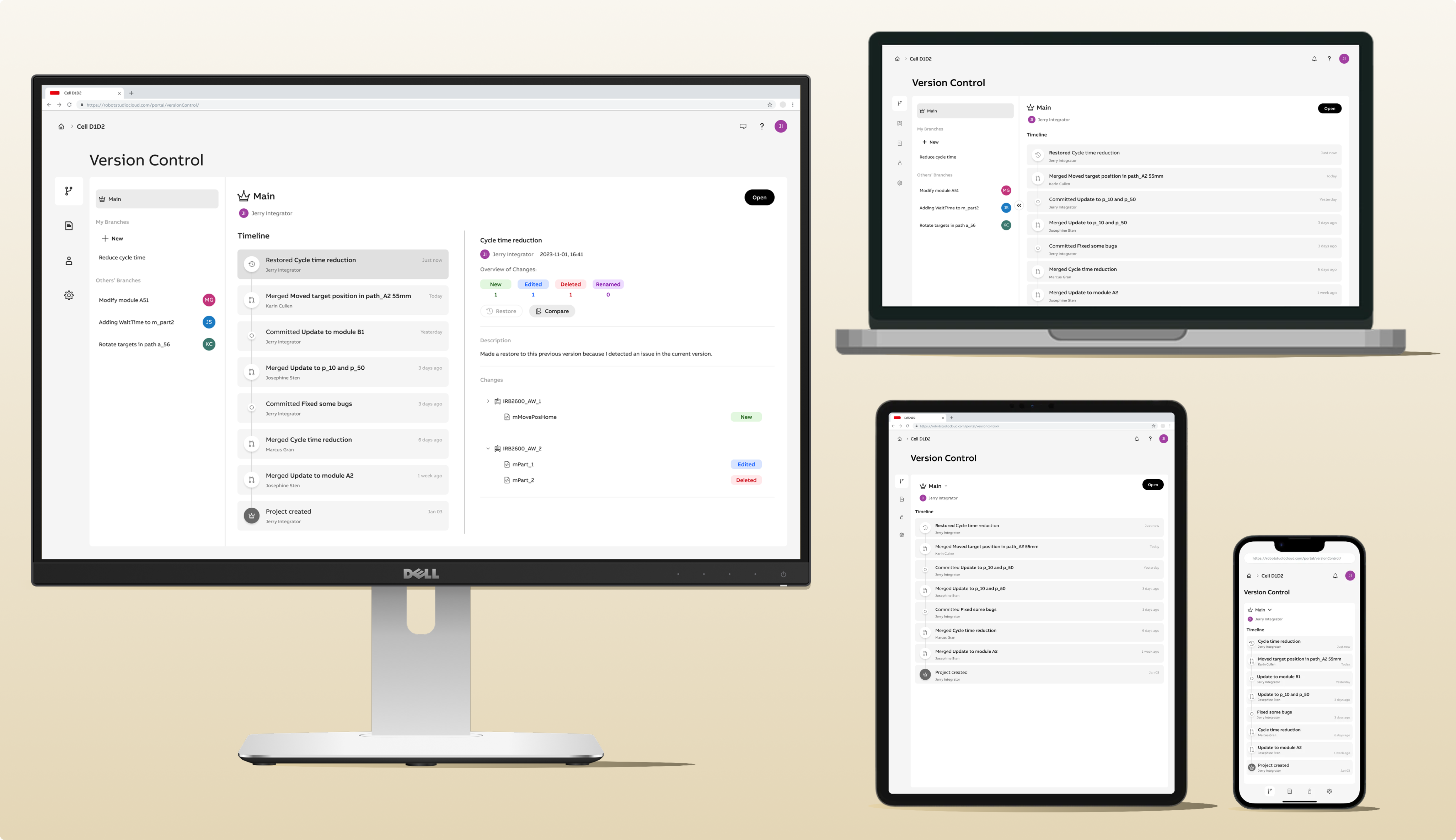
Responsive Design - Accessible from any device
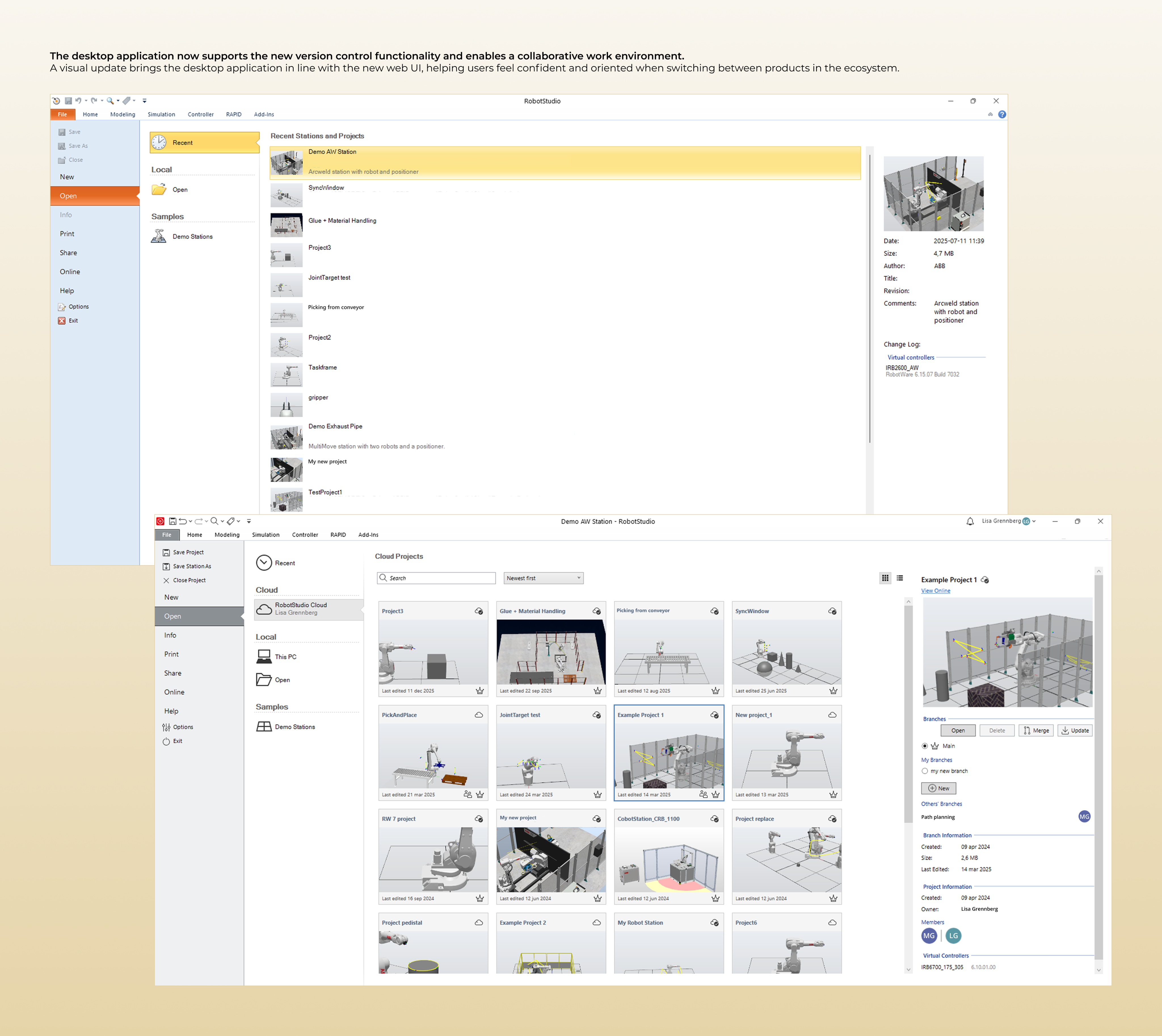
Desktop Application - Version Control, Collaboration and Visual Update
Main Takeaways
- Cross-platform design mattersDesigning workflows across desktop and web platforms requires careful consideration of roles, functionality, and consistency.
- Responsive design is more than resizingContent and features must adapt to the purpose of use on each device, not just the screen size.
- Version control can be simplified for new usersComplex concepts like branches and commits can be made accessible without overwhelming users.
- User research drives impactful designEarly insights into workflow challenges shaped the application’s core features and informed every stage of design and testing.
- Collaboration is keyContinuous communication with developers, product management, and stakeholders ensured feasibility, consistency, and timely delivery.

RobotStudio® Cloud
A collaborative online robot programming application.
ABB ROBOTICS
Research
UX
UI
User Testing
UX Strategy
Goal:
The goal of the project was to make offline robot programming accessible beyond a desktop-only context by exploring a web-based approach that could support both new and experienced users. The project also aimed to expand the product into a new business segment by introducing collaborative and version-aware workflows across web and desktop environments, while maintaining continuity with the existing software ecosystem.
Outcome:
The project resulted in the successful launch of RobotStudio® Cloud introducing a new product to the existing product suite of robot simulation software with over 60.000 users. The web-based application extends offline robot programming beyond a desktop-only workflow, and enables confident creation, simulation, and collaboration on robot simulation projects.
My Role
Responsible for end-to-end UX design of the web-based application, including UI design and user flow definition. This included designing cross-platform workflows between the existing desktop application and the new web experience. The role also covered planning and conducting beta testing with users prior to release, as well as close collaboration with developers throughout implementation to ensure design quality and feasibility.
Tool & Process
- Figma Design: UI design and interactive prototyping.
- Figjam: User flow and information architecture definition.
- Microsoft Forms: User surveys and beta testing.
- SAFe Methodology: Agile project execution through prioritized, task-based iterative development.
Overview
Project Aim
This project set out to address several critical needs faced by robot programmers during offline simulation and tuning workflows. The primary goal was to give users greater control over their progress, enabling safe experimentation and iteration without the risk of losing work. Another key objective was to enable seamless collaboration, allowing multiple colleagues to work on the same project simultaneously without relying on manual file exchange. The project also aimed to push the boundaries of the robot software industry by bringing offline robot programming to the web for the first time making it accessible from any device, anywhere. Finally, the solution focused on lowering the barrier to entry during the tuning phase of robot programming by delivering a simple, usability-driven web application tailored for modifying and refining robot programs in the later stages of a project.
Key Design Challenges
- Enabling robot programmers to track progress and changes throughout offline simulation projects.
- Designing a collaborative environment optimised for sharing work and resolving conflicts between multiple users.
- Introducing robot programming software to the web while maintaining continuity with the existing desktop software ecosystem.
- Adapting a complex, feature-rich application interface to remain usable and accessible across devices.
- Translating well-proven concepts from the software development domain (such as version control and collaboration) to the specific context of offline robot simulation.
Process


Sections
Click to navigate →
Research
Understanding the user journey
The domain of robotics is inherently complex. Many end customers looking to automate production rely on specialist system integrator companies to design and implement their production lines. As a result, system integrators are the primary users of robot simulation software, focused on delivering safe, reliable solutions that meet production targets efficiently.
To achieve this, system integrators use tools like RobotStudio to build virtual replicas of production cells and simulate solutions before deployment. Within these workflows, multiple roles collaborate closely, for example; mechanical engineers design hardware components such as conveyor belts and custom machines, while robot programmers develop the code that determines how robots move and perform their assigned tasks, ranging from pallet handling to arc welding.
Designing an effective application requires understanding what motivates users and identifying parts of the user journey that could be made more efficient. User research conducted prior to this project highlighted several challenges with the current way of working, which became the driving force for initiating the project:
Difficulty tracking changes throughout a project

Users frequently saved multiple versions of the same project to experiment freely without fear of losing work, but managing these versions was cumbersome and increased the risk of errors or lost progress.
Limited access across devices
Projects were typically stored locally, making it difficult to access work from multiple devices. Sharing large project files via email or other platforms was slow and error-prone.
Collaboration challenges
Large local files and manual sharing prevented multiple users from working on the same project simultaneously, leading to version conflicts and inefficiencies.
Complexity during the tuning phase
While the existing desktop application provides powerful offline programming functionality, its complexity can overwhelm users during the tuning phase. Users needed a simplified interface to efficiently edit, debug, and optimize robot programs without distraction from unnecessary features.
Persona
A primary persona was defined to help all project stakeholders, including designers and developers, develop a clear understanding of the target users who would ultimately interact with the application. This persona captured key characteristics, goals, and pain points of system integrators working with robot simulation software, highlighting their need for efficiency, control, and collaborative workflows.
The persona served as a reference point throughout the project, guiding discussions about which features to include, how workflows should be structured, and how the interface could best support users’ tasks. By anchoring design decisions in a real user archetype, the team was able to align cross-functional stakeholders and ensure the application was tailored to the practical needs and motivations of its end users.
The Robot Tuner
About
I work at a system integrator company, helping industrial companies to automate their production. I feel familiar with RobotStudio as I have been using it for a several years. On a typical day I am working with offline programming and simulation of robots, building new solutions for customers or helping them optimize existing solutions by reducing cycle time or updating robot paths according to new product versions.
Goals
- Feel confident when making changes.
- Track changes done to the robot program.
- Help the customers improve quality and production speed over time by tuning robot programs.
- Be efficient and fast.
Frustrations
- Fear of accidentally changing something without knowing it.
- Handling project versions is messy.
- Overwhelming amount of functions in the application not necessary when tuning the program.
- Time pressure.
What the user says
“Version handling is one of the negative sides to robot programming”
“Accidentally moving objects in the virtual station can result in real production stops if not noticed”
“Testing a new solution can be time consuming if it does not work and you have to return to the original solution”
“Managing multiple saved versions of the same project makes it unclear which version should be used moving forward”
Benchmark
At the time of the project, robot programming tools were technically powerful but often lagged behind other software domains in terms of usability and modern interface design. While robot programming is a specialised field, its workflows closely resemble conventional software development including writing logic, testing, iterating, and debugging.
User research revealed challenges that closely mirrored problems already solved in other domains through version control systems. These systems support tracking changes, safe experimentation, collaboration, and progress review. Similar principles have even been successfully adapted for non-programmers in tools such as Figma.
Encountering version control for the first time myself helped me empathize with users who were unfamiliar with these concepts. This experience directly informed design decisions, reinforcing the need to make version control functionality approachable, transparent, and easy to understand within the context of robot programming.
To explore how these concepts could be translated effectively, I benchmarked software across programming, 3D modelling, and file-sharing domains. This helped identify patterns, conventions, and trade-offs relevant to designing a collaborative, versioned workflow for robot programmers.
Key Insights:
- Complexity must match user expertise: While robot programmers are highly technical, many are unfamiliar with traditional version control systems. The solution therefore needed to be intuitive and approachable, avoiding unnecessary complexity while still supporting advanced workflows when required.
- Leverage established domain conventions, carefully: Version control systems rely on well-established terminology and interaction patterns. Concepts such as branch, commit, merge, and master/main appeared consistently across the majority of benchmarked tools. Reusing familiar conventions can help experienced users quickly orient themselves and recognise established workflows.However, this comes with a trade-off as users new to version control may find this vocabulary intimidating or unclear. This insight highlighted the need to balance technical accuracy with clarity, potentially through more descriptive language, progressive disclosure, or contextual guidance, to ensure accessibility without sacrificing consistency.
Design
Define main user flows
This project introduced a new web application intended to complement an existing desktop product while also delivering standalone value. A key part of the design process was defining the main user flows to understand how users should move between the two environments, what tasks belonged where, and how transitions could feel seamless rather than disruptive.
One of the central challenges was introducing version control as a new capability across the product ecosystem. At the time, users relied largely on manual file handling to manage iterations and collaborate, which often led to confusion and duplicated work. Defining the user flows therefore involved exploring how version control concepts could be integrated into existing desktop workflows while leveraging the web application as a space for broader oversight and collaboration.
User flow mapping suggested positioning the desktop application as the primary space for hands-on programming tasks, such as building the station environment and iterating on robot programs. The web application was explored as a complementary layer for higher-level activities later in the project lifecycle, including tuning robot program for optimization, reviewing change history, managing branches, and administering collaborators. Establishing these boundaries helped clarify when users should remain in the desktop context and when it was more appropriate to transition to the web experience.
Main activities per platform
Web Portal
- View projects
- Open project in web app
- Open project in desktop app
- Delete project
- Download project locally
- Share projects
- Invite user
- View invited users
- Remove invited user
- View project details
- View change history
- Compare project versions
- View branches
- Create branch
- Edit project
Web Application
- Open a project
- Review project
- Station layout
- Program code
- Run simulation
- Verify execution
- Control cycle time
- Edit project
- Reposition program points
- Change instruction arguments
- Edit program logic
Desktop Application
- View projects
- Open main branch
- Create new branch
- Create new project
- Build station layout
- Create robot program
- Set up controller configuration
- Edit project
- Make changes
- Review changes
- Save changes
- Get notified about other users changes
- Stay in tune with main branch
- Merge branch to main
- Update branch from main
Main user flow - Web
Main user flow - Desktop
Defining the collaboration flows required careful consideration of user roles and permissions. Key decisions focused on balancing openness and collaboration with control, transparency, and project integrity, ensuring multiple users could contribute without risking accidental overwrites or loss of ownership.
Two user roles were defined: Owner and Member:
- The Owner is the user who creates and owns the project and has full control over it.
- A Member is a user invited to collaborate on the project.
The primary distinction between these roles lies in how changes are made and managed. Owners can edit the main project branch directly, while Members must first create their own branches to make changes. These changes can then be reviewed and merged back into the main branch.
This approach allows multiple users to work on the same project in parallel while maintaining a single source of truth. It ensures that contributions are transparent, clearly showing who made which changes and when, while enabling safe experimentation without compromising the stability of the main project.
Version control concept
Impact:
Insights from the pre-study helped distinguish which flows and functionalities were essential for delivering core value in the first release and which could be introduced in later iterations. These prioritisation decisions were made in close collaboration with stakeholders from design, engineering, and business to ensure alignment between user needs, technical feasibility, and business objectives.
This structured approach ensured that the first release delivered meaningful value from day one, while leaving clear pathways to extend functionality in future iterations according to the project roadmap.
Information Architecture
The first step was to define the structure of the new web application, including the main pages and how users would navigate between them. It was important to establish the overall layout, determine the placement and behavior of the main navigation, and create an initial plan for how different functions should be organized and triggered. This helped ensure that the application would be intuitive, consistent, and aligned with user workflows from the start.
Once the high-level structure was reviewed and agreed upon by stakeholders, detailed design work could begin. Aligning on architectural decisions before moving into interface design helped reduce uncertainty, avoid costly changes later in development, and provided a solid foundation for iterative design and delivery.
Site Map (simplified)
UI Design Iterations
The project progressed through multiple design iterations on the path to a final solution. Given the scope and complexity of the UI work, an agile approach was adopted, breaking the product down into feature-level design tasks. Each feature was defined by clear goals and requirements and explored individually, allowing focused design efforts while maintaining momentum across the broader system.
With the main views established in the sitemap, their core structure was outlined through lo-fi and mid-fidelity sketches. This created a shared baseline before moving into detailed user flows and interface design. At this stage, the focus was on defining key layout principles, such as navigation placement, hierarchy of primary content, and how more detailed information should be accessed. The sketches enabled rapid exploration of alternatives and served as a tool to facilitate alignment with stakeholders before committing to higher-fidelity designs.
While individual features were explored independently, they were continuously evaluated within the context of the overall system. As new insights and dependencies emerged, earlier decisions were revisited and refined to ensure cohesion across the product. This iterative back-and-forth was essential in maintaining consistency and accommodating requirements that surfaced later in the process.
Two key considerations guided the design phase: responsive design and developer handoff. All UI designs needed to adapt seamlessly across screen sizes, from desktop to tablet and mobile. With no established company guidelines for responsive web design, foundational patterns were defined as part of the project. This included establishing breakpoints, spacing and padding systems, content flow patterns, and designing mobile-specific, touch-friendly components.
Responsive design was treated not only as a layout challenge, but as a contextual one. Different devices supported different user needs: desktop users were more likely to perform complex project management and version control tasks, while mobile users typically required quick access to updates or lightweight interactions. As a result, content prioritization, UI density, and available actions were adapted to suit each context.
To support implementation, detailed design annotations were provided to communicate how components should scale, shift in prominence, and adapt behavior across breakpoints, ensuring a smooth and well defined developer handoff.
Responsive Design
Large - Laptop
The UI at the large breakpoint has all options enabled, equivalent to the XL display. The main difference is that the user must switch between content areas using expand and collapse functionality.
- Since all content cannot be displayed at the same time, the UI supports easy alternation between page navigation and content inspection through a single click.
Medium - Tablet
The UI at the medium breakpoint has is primarily intended for viewing, with a limited set of enabled operations. Users can view the main branch, their own branches, and branches created by others. They can also open the project in the web application to view or present the project.
- The timeline for tracking changes is the default view. From there, the user can navigate to other pages and features.
Small - Mobile
The UI for the small breakpoint has a view only purpose.Restore is the only available action allowing error recovery.
- Content has to be presented in different views.
- User can navigate to discover more details if needed.
Design Specification
Another significant challenge was maintaining consistency across two applications with different design systems. The legacy desktop product followed a Microsoft-influenced visual style, while the new web application was based on a cleaner, monochrome interface aligned with the company’s updated design system. A key goal was to ensure that both applications felt like part of the same product family, especially for shared concepts such as version control, including creating branches, reviewing and committing changes, and viewing the project dashboard. Aligning interaction patterns, visual cues, and terminology helped reduce cognitive load and enabled a more seamless cross-platform experience.
The introduction of version control introduced new functionality that required clear and recognizable iconography. Because these icons needed to work across both desktop and web applications, aligning the visual language between platforms became a strategic UX requirement rather than a purely visual task. The existing icon set in the desktop application was outdated and lacked consistency, which presented an opportunity to modernize the iconography and establish a shared, scalable icon system. This update helped ensure visual consistency across products, supported future feature expansion, and reinforced a cohesive user experience across the broader software ecosystem.
UI Alignment
Realization
Implementation support
During the project, detailed design specifications were created and handed over to development at a feature level. The work followed an agile delivery model aligned with the SAFe framework, with incremental planning and continuous refinement throughout the development cycle.
The final implementation involved multiple development teams working in parallel on different parts of the product. This required ongoing collaboration with engineers, product managers, and other stakeholders across several product teams. As the UX designer, I maintained continuous dialogue to clarify design intent, respond to technical constraints, and support decision-making as features moved from design into implementation.
Close collaboration helped ensure that the implemented solutions were technically feasible, met functional requirements, addressed user needs, and remained consistent across both the desktop and web platforms. By staying closely involved throughout implementation, design decisions could be validated, adjusted, and aligned with technical realities without compromising the user experience or delivery timeline.
Beta user Testing
Before the official release, a group of users took part in beta testing, providing feedback on usability, workflows, and overall functionality. The goal was to verify both the technical readiness of the application and whether it met user expectations and needs. Feedback was collected through surveys and follow-up interviews to capture first-time experiences and uncover deeper insights.
The beta testing process included several key phases:
- Introduction Meeting: Users were introduced to the software, its main functionality, and intended use cases.
- Testing Phase: Users explored the beta application on their own time, experimenting with features, discovering capabilities, and identifying potential bugs or areas of confusion.
- Survey: Captured initial impressions, usability perceptions, and overall sentiment.
- Follow-Up Interviews: Explored the reasoning behind users’ initial experiences, highlighting what worked well and identifying areas for improvement.
This structured beta testing approach allowed the team to identify friction points and refine key interactions, ensuring the product was both reliable and intuitive at launch. The insights from beta testing directly informed prioritization decisions for the initial release and established a feedback-driven foundation for the product’s ongoing evolution.
Product Release
Being part of the product’s journey from initial concepts and design specifications to a fully functional software application was both exciting and rewarding. Being involved throughout the process allowed me to ensure the product met user needs, delivered a seamless experience, and stayed true to the design vision. Close collaboration with developers, product management, and other stakeholders helped address last-minute challenges and contributed to a smooth and successful launch. The release of this new web-based software added value to the already well known and used product suite of robot simulation software with over 60.000 users.
Outcome
The project resulted in the launch of RobotStudio® Cloud, a new web-based product within the RobotStudio® Suite. The application allows users to confidently create, simulate, and collaborate on robot simulation projects, extending offline robot programming beyond a desktop-only workflow. Key outcomes:
- Cross-platform collaboration: Users can now work together on the same project in real time and manage versions through branches and a shared history
- Accessible from any device: Projects can be accessed from desktops, tablets, and mobile devices, supporting different contexts of use.
- Simplified user experience: The web application focuses on ease of use, particularly for the tuning phase, while maintaining continuity with the existing desktop software.
- Validated through beta testing: Iterative user feedback ensured that workflows were intuitive, version control was understandable, and the product addressed real user needs.
The release of RobotStudio® Cloud represents a step forward in making offline robot programming more flexible, collaborative, and user-friendly, opening new possibilities for system integrators and robot application specialists.
Key Design Views
Web Portal - Dashboard
View Project - Version Control and Team View
Web Application - Tuning and Optimizing Robot Program
Responsive Design - Accessible from any device
Desktop Application - Version Control, Collaboration and Visual Update
Main Takeaways
- Cross-platform design mattersDesigning workflows across desktop and web platforms requires careful consideration of roles, functionality, and consistency.
- Responsive design is more than resizingContent and features must adapt to the purpose of use on each device, not just the screen size.
- Version control can be simplified for new usersComplex concepts like branches and commits can be made accessible without overwhelming users.
- User research drives impactful designEarly insights into workflow challenges shaped the application’s core features and informed every stage of design and testing.
- Collaboration is keyContinuous communication with developers, product management, and stakeholders ensured feasibility, consistency, and timely delivery.
RobotStudio® Cloud
A collaborative online robot programming application.
ABB ROBOTICS
Research
UX
UI
User Testing
UX Strategy
Goal:
The goal of the project was to make offline robot programming accessible beyond a desktop-only context by exploring a web-based approach that could support both new and experienced users. The project also aimed to expand the product into a new business segment by introducing collaborative and version-aware workflows across web and desktop environments, while maintaining continuity with the existing software ecosystem.
Outcome:
The project resulted in the successful launch of RobotStudio® Cloud introducing a new product to the existing product suite of robot simulation software with over 60.000 users. The web-based application extends offline robot programming beyond a desktop-only workflow, and enables confident creation, simulation, and collaboration on robot simulation projects.
My Role
Responsible for end-to-end UX design of the web-based application, including UI design and user flow definition. This included designing cross-platform workflows between the existing desktop application and the new web experience. The role also covered planning and conducting beta testing with users prior to release, as well as close collaboration with developers throughout implementation to ensure design quality and feasibility.
Tool & Process
- Figma Design: UI design and interactive prototyping.
- Figjam: User flow and information architecture definition.
- Microsoft Forms: User surveys and beta testing.
- SAFe Methodology: Agile project execution through prioritized, task-based iterative development.
Overview
Project Aim
This project set out to address several critical needs faced by robot programmers during offline simulation and tuning workflows. The primary goal was to give users greater control over their progress, enabling safe experimentation and iteration without the risk of losing work. Another key objective was to enable seamless collaboration, allowing multiple colleagues to work on the same project simultaneously without relying on manual file exchange. The project also aimed to push the boundaries of the robot software industry by bringing offline robot programming to the web for the first time making it accessible from any device, anywhere. Finally, the solution focused on lowering the barrier to entry during the tuning phase of robot programming by delivering a simple, usability-driven web application tailored for modifying and refining robot programs in the later stages of a project.
Key Design Challenges
- Enabling robot programmers to track progress and changes throughout offline simulation projects.
- Designing a collaborative environment optimised for sharing work and resolving conflicts between multiple users.
- Introducing robot programming software to the web while maintaining continuity with the existing desktop software ecosystem.
- Adapting a complex, feature-rich application interface to remain usable and accessible across devices.
- Translating well-proven concepts from the software development domain (such as version control and collaboration) to the specific context of offline robot simulation.
Process

Sections
Click to navigate →
Research
Understanding the user journey
The domain of robotics is inherently complex. Many end customers looking to automate production rely on specialist system integrator companies to design and implement their production lines. As a result, system integrators are the primary users of robot simulation software, focused on delivering safe, reliable solutions that meet production targets efficiently.
To achieve this, system integrators use tools like RobotStudio to build virtual replicas of production cells and simulate solutions before deployment. Within these workflows, multiple roles collaborate closely, for example; mechanical engineers design hardware components such as conveyor belts and custom machines, while robot programmers develop the code that determines how robots move and perform their assigned tasks, ranging from pallet handling to arc welding.
Designing an effective application requires understanding what motivates users and identifying parts of the user journey that could be made more efficient. User research conducted prior to this project highlighted several challenges with the current way of working, which became the driving force for initiating the project:
Difficulty tracking changes throughout a project
Users frequently saved multiple versions of the same project to experiment freely without fear of losing work, but managing these versions was cumbersome and increased the risk of errors or lost progress.
Limited access across devices
Projects were typically stored locally, making it difficult to access work from multiple devices. Sharing large project files via email or other platforms was slow and error-prone.
Collaboration challenges
Large local files and manual sharing prevented multiple users from working on the same project simultaneously, leading to version conflicts and inefficiencies.
Complexity during the tuning phase
While the existing desktop application provides powerful offline programming functionality, its complexity can overwhelm users during the tuning phase. Users needed a simplified interface to efficiently edit, debug, and optimize robot programs without distraction from unnecessary features.
Persona
A primary persona was defined to help all project stakeholders, including designers and developers, develop a clear understanding of the target users who would ultimately interact with the application. This persona captured key characteristics, goals, and pain points of system integrators working with robot simulation software, highlighting their need for efficiency, control, and collaborative workflows.
The persona served as a reference point throughout the project, guiding discussions about which features to include, how workflows should be structured, and how the interface could best support users’ tasks. By anchoring design decisions in a real user archetype, the team was able to align cross-functional stakeholders and ensure the application was tailored to the practical needs and motivations of its end users.
The Robot Tuner

About
I work at a system integrator company, helping industrial companies to automate their production. I feel familiar with RobotStudio as I have been using it for a several years. On a typical day I am working with offline programming and simulation of robots, building new solutions for customers or helping them optimize existing solutions by reducing cycle time or updating robot paths according to new product versions.

Goals
- Feel confident when making changes.
- Track changes done to the robot program.
- Help the customers improve quality and production speed over time by tuning robot programs.
- Be efficient and fast.
Frustrations
- Fear of accidentally changing something without knowing it.
- Handling project versions is messy.
- Overwhelming amount of functions in the application not necessary when tuning the program.
- Time pressure.
What the user says
“Version handling is one of the negative sides to robot programming”
“Accidentally moving objects in the virtual station can result in real production stops if not noticed”
“Testing a new solution can be time consuming if it does not work and you have to return to the original solution”
“Managing multiple saved versions of the same project makes it unclear which version should be used moving forward”
Benchmark
At the time of the project, robot programming tools were technically powerful but often lagged behind other software domains in terms of usability and modern interface design. While robot programming is a specialised field, its workflows closely resemble conventional software development including writing logic, testing, iterating, and debugging.
User research revealed challenges that closely mirrored problems already solved in other domains through version control systems. These systems support tracking changes, safe experimentation, collaboration, and progress review. Similar principles have even been successfully adapted for non-programmers in tools such as Figma.
Encountering version control for the first time myself helped me empathize with users who were unfamiliar with these concepts. This experience directly informed design decisions, reinforcing the need to make version control functionality approachable, transparent, and easy to understand within the context of robot programming.
To explore how these concepts could be translated effectively, I benchmarked software across programming, 3D modelling, and file-sharing domains. This helped identify patterns, conventions, and trade-offs relevant to designing a collaborative, versioned workflow for robot programmers.
Key Insights:
- Complexity must match user expertise: While robot programmers are highly technical, many are unfamiliar with traditional version control systems. The solution therefore needed to be intuitive and approachable, avoiding unnecessary complexity while still supporting advanced workflows when required.
- Leverage established domain conventions, carefully: Version control systems rely on well-established terminology and interaction patterns. Concepts such as branch, commit, merge, and master/main appeared consistently across the majority of benchmarked tools. Reusing familiar conventions can help experienced users quickly orient themselves and recognise established workflows.However, this comes with a trade-off as users new to version control may find this vocabulary intimidating or unclear. This insight highlighted the need to balance technical accuracy with clarity, potentially through more descriptive language, progressive disclosure, or contextual guidance, to ensure accessibility without sacrificing consistency.
Design
Define main user flows
This project introduced a new web application intended to complement an existing desktop product while also delivering standalone value. A key part of the design process was defining the main user flows to understand how users should move between the two environments, what tasks belonged where, and how transitions could feel seamless rather than disruptive.
One of the central challenges was introducing version control as a new capability across the product ecosystem. At the time, users relied largely on manual file handling to manage iterations and collaborate, which often led to confusion and duplicated work. Defining the user flows therefore involved exploring how version control concepts could be integrated into existing desktop workflows while leveraging the web application as a space for broader oversight and collaboration.
User flow mapping suggested positioning the desktop application as the primary space for hands-on programming tasks, such as building the station environment and iterating on robot programs. The web application was explored as a complementary layer for higher-level activities later in the project lifecycle, including tuning robot program for optimization, reviewing change history, managing branches, and administering collaborators. Establishing these boundaries helped clarify when users should remain in the desktop context and when it was more appropriate to transition to the web experience.
Main activities per platform
Web Portal
- View projects
- Open project in web app
- Open project in desktop app
- Delete project
- Download project locally
- Share projects
- Invite user
- View invited users
- Remove invited user
- View project details
- View change history
- Compare project versions
- View branches
- Create branch
- Edit project
Web Application
- Open a project
- Review project
- Station layout
- Program code
- Run simulation
- Verify execution
- Control cycle time
- Edit project
- Reposition program points
- Change instruction arguments
- Edit program logic
Desktop Application
- View projects
- Open main branch
- Create new branch
- Create new project
- Build station layout
- Create robot program
- Set up controller configuration
- Edit project
- Make changes
- Review changes
- Save changes
- Get notified about other users changes
- Stay in tune with main branch
- Merge branch to main
- Update branch from main
Main user flow - Web
Main user flow - Desktop
Defining the collaboration flows required careful consideration of user roles and permissions. Key decisions focused on balancing openness and collaboration with control, transparency, and project integrity, ensuring multiple users could contribute without risking accidental overwrites or loss of ownership.
Two user roles were defined: Owner and Member:
- The Owner is the user who creates and owns the project and has full control over it.
- A Member is a user invited to collaborate on the project.
The primary distinction between these roles lies in how changes are made and managed. Owners can edit the main project branch directly, while Members must first create their own branches to make changes. These changes can then be reviewed and merged back into the main branch.
This approach allows multiple users to work on the same project in parallel while maintaining a single source of truth. It ensures that contributions are transparent, clearly showing who made which changes and when, while enabling safe experimentation without compromising the stability of the main project.
Version control concept
Impact:
Insights from the pre-study helped distinguish which flows and functionalities were essential for delivering core value in the first release and which could be introduced in later iterations. These prioritisation decisions were made in close collaboration with stakeholders from design, engineering, and business to ensure alignment between user needs, technical feasibility, and business objectives.
This structured approach ensured that the first release delivered meaningful value from day one, while leaving clear pathways to extend functionality in future iterations according to the project roadmap.
Information Architecture
The first step was to define the structure of the new web application, including the main pages and how users would navigate between them. It was important to establish the overall layout, determine the placement and behavior of the main navigation, and create an initial plan for how different functions should be organized and triggered. This helped ensure that the application would be intuitive, consistent, and aligned with user workflows from the start.
Once the high-level structure was reviewed and agreed upon by stakeholders, detailed design work could begin. Aligning on architectural decisions before moving into interface design helped reduce uncertainty, avoid costly changes later in development, and provided a solid foundation for iterative design and delivery.
Site Map (simplified)
UI Design Iterations
The project progressed through multiple design iterations on the path to a final solution. Given the scope and complexity of the UI work, an agile approach was adopted, breaking the product down into feature-level design tasks. Each feature was defined by clear goals and requirements and explored individually, allowing focused design efforts while maintaining momentum across the broader system.
With the main views established in the sitemap, their core structure was outlined through lo-fi and mid-fidelity sketches. This created a shared baseline before moving into detailed user flows and interface design. At this stage, the focus was on defining key layout principles, such as navigation placement, hierarchy of primary content, and how more detailed information should be accessed. The sketches enabled rapid exploration of alternatives and served as a tool to facilitate alignment with stakeholders before committing to higher-fidelity designs.
While individual features were explored independently, they were continuously evaluated within the context of the overall system. As new insights and dependencies emerged, earlier decisions were revisited and refined to ensure cohesion across the product. This iterative back-and-forth was essential in maintaining consistency and accommodating requirements that surfaced later in the process.
Two key considerations guided the design phase: responsive design and developer handoff. All UI designs needed to adapt seamlessly across screen sizes, from desktop to tablet and mobile. With no established company guidelines for responsive web design, foundational patterns were defined as part of the project. This included establishing breakpoints, spacing and padding systems, content flow patterns, and designing mobile-specific, touch-friendly components.
Responsive design was treated not only as a layout challenge, but as a contextual one. Different devices supported different user needs: desktop users were more likely to perform complex project management and version control tasks, while mobile users typically required quick access to updates or lightweight interactions. As a result, content prioritization, UI density, and available actions were adapted to suit each context.
To support implementation, detailed design annotations were provided to communicate how components should scale, shift in prominence, and adapt behavior across breakpoints, ensuring a smooth and well defined developer handoff.
Responsive Design
Large - Laptop
The UI at the large breakpoint has all options enabled, equivalent to the XL displayThe main difference is that the user must switch between content areas using expand and collapse functionality.
- Since all content cannot be displayed at the same time, the UI supports easy alternation between page navigation and content inspection through a single click.
Medium - Tablet
The UI at the medium breakpoint has is primarily intended for viewing, with a limited set of enabled operations.Users can view the main branch, their own branches, and branches created by others. They can also open the project in the web application to view or present the project.
- The timeline for tracking changes is the default view. From there, the user can navigate to other pages and features.
Small - Mobile
The UI for the small breakpoint has a view only purpose.Restore is the only available action allowing error recovery.
- Content has to be presented in different views.
- User can navigate to discover more details if needed.
The UI for the small breakpoint has a view only purpose.Restore is the only available action allowing error recovery.
- Content has to be presented in different views.
- User can navigate to discover more details if needed.
Design Specification
Another significant challenge was maintaining consistency across two applications with different design systems. The legacy desktop product followed a Microsoft-influenced visual style, while the new web application was based on a cleaner, monochrome interface aligned with the company’s updated design system. A key goal was to ensure that both applications felt like part of the same product family, especially for shared concepts such as version control, including creating branches, reviewing and committing changes, and viewing the project dashboard. Aligning interaction patterns, visual cues, and terminology helped reduce cognitive load and enabled a more seamless cross-platform experience.
The introduction of version control introduced new functionality that required clear and recognizable iconography. Because these icons needed to work across both desktop and web applications, aligning the visual language between platforms became a strategic UX requirement rather than a purely visual task. The existing icon set in the desktop application was outdated and lacked consistency, which presented an opportunity to modernize the iconography and establish a shared, scalable icon system. This update helped ensure visual consistency across products, supported future feature expansion, and reinforced a cohesive user experience across the broader software ecosystem.
UI Alignment
Realization
Implementation support
During the project, detailed design specifications were created and handed over to development at a feature level. The work followed an agile delivery model aligned with the SAFe framework, with incremental planning and continuous refinement throughout the development cycle.
The final implementation involved multiple development teams working in parallel on different parts of the product. This required ongoing collaboration with engineers, product managers, and other stakeholders across several product teams. As the UX designer, I maintained continuous dialogue to clarify design intent, respond to technical constraints, and support decision-making as features moved from design into implementation.
Close collaboration helped ensure that the implemented solutions were technically feasible, met functional requirements, addressed user needs, and remained consistent across both the desktop and web platforms. By staying closely involved throughout implementation, design decisions could be validated, adjusted, and aligned with technical realities without compromising the user experience or delivery timeline.
Beta user Testing
Before the official release, a group of users took part in beta testing, providing feedback on usability, workflows, and overall functionality. The goal was to verify both the technical readiness of the application and whether it met user expectations and needs. Feedback was collected through surveys and follow-up interviews to capture first-time experiences and uncover deeper insights.
The beta testing process included several key phases:
- Introduction Meeting: Users were introduced to the software, its main functionality, and intended use cases.
- Testing Phase: Users explored the beta application on their own time, experimenting with features, discovering capabilities, and identifying potential bugs or areas of confusion.
- Survey: Captured initial impressions, usability perceptions, and overall sentiment.
- Follow-Up Interviews: Explored the reasoning behind users’ initial experiences, highlighting what worked well and identifying areas for improvement.
This structured beta testing approach allowed the team to identify friction points and refine key interactions, ensuring the product was both reliable and intuitive at launch. The insights from beta testing directly informed prioritization decisions for the initial release and established a feedback-driven foundation for the product’s ongoing evolution.
Product Release
To be part of the product’s journey from initial concepts and design specifications to a fully functional software application was both exciting and rewarding. Being involved throughout the process allowed me to ensure the product met user needs, delivered a seamless experience, and stayed true to the design vision. Close collaboration with developers, product management, and other stakeholders helped address last-minute challenges and contributed to a smooth and successful launch. The release of this new web-based software added value to the already well known and used product suite of robot simulation software with over 60.000 users.
Outcome
The project resulted in the launch of RobotStudio® Cloud, a new web-based product within the RobotStudio® Suite. The application allows users to confidently create, simulate, and collaborate on robot simulation projects, extending offline robot programming beyond a desktop-only workflow. Key outcomes:
- Cross-platform collaboration: Users can now work together on the same project in real time and manage versions through branches and a shared history
- Accessible from any device: Projects can be accessed from desktops, tablets, and mobile devices, supporting different contexts of use.
- Simplified user experience: The web application focuses on ease of use, particularly for the tuning phase, while maintaining continuity with the existing desktop software.
- Validated through beta testing: Iterative user feedback ensured that workflows were intuitive, version control was understandable, and the product addressed real user needs.
The release of RobotStudio® Cloud represents a step forward in making offline robot programming more flexible, collaborative, and user-friendly, opening new possibilities for system integrators and robot application specialists.
Key Design Views
Web Portal - Dashboard
View Project - Version Control and Team View
Web Application - Tuning and Optimizing Robot Program
Responsive Design - Accessible from any device
Desktop Application - Version Control, Collaboration and Visual Update
Main Takeaways
- Cross-platform design mattersDesigning workflows across desktop and web platforms requires careful consideration of roles, functionality, and consistency.
- Responsive design is more than resizingContent and features must adapt to the purpose of use on each device, not just the screen size.
- Version control can be simplified for new usersComplex concepts like branches and commits can be made accessible without overwhelming users.
- User research drives impactful designEarly insights into workflow challenges shaped the application’s core features and informed every stage of design and testing.
- Collaboration is keyContinuous communication with developers, product management, and stakeholders ensured feasibility, consistency, and timely delivery.